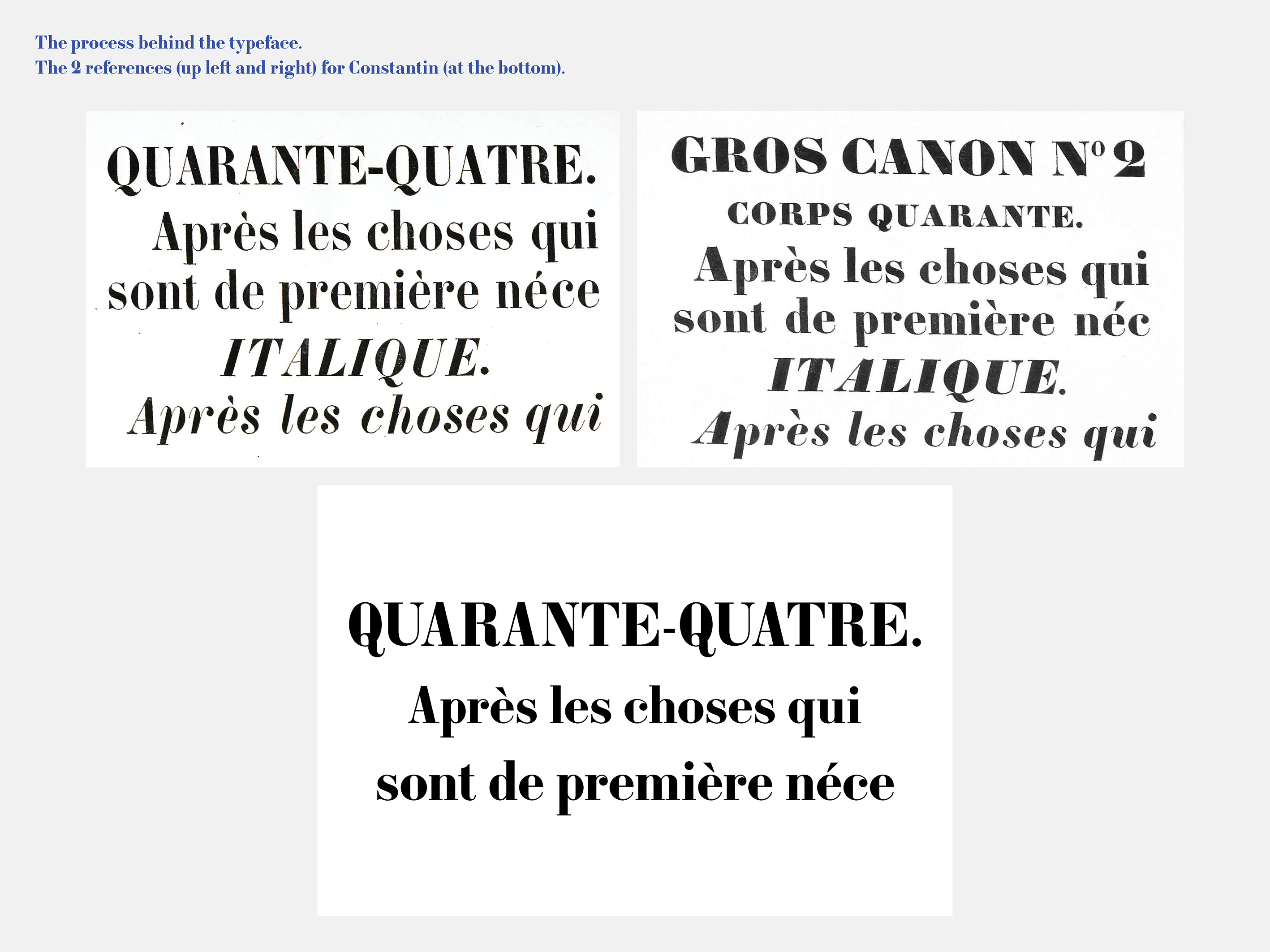
Based on the work of the Constantin widows – whose foundry operated in Nancy, France, during the 19th century – I designed this didone style bold typeface. (Caractères de la fonderie de veuve Constantin ainé et Constantin jeune, à Nancy, Meurthe.)
My work offers an interpretation on the original typeface design, and the first sketches were specifically based on the “gros canon” body size letters. In this design, the thick and thin lines are highly contrasted, the stroke terminals end in a round form, and sharp cuts evoke a contemporary feel.
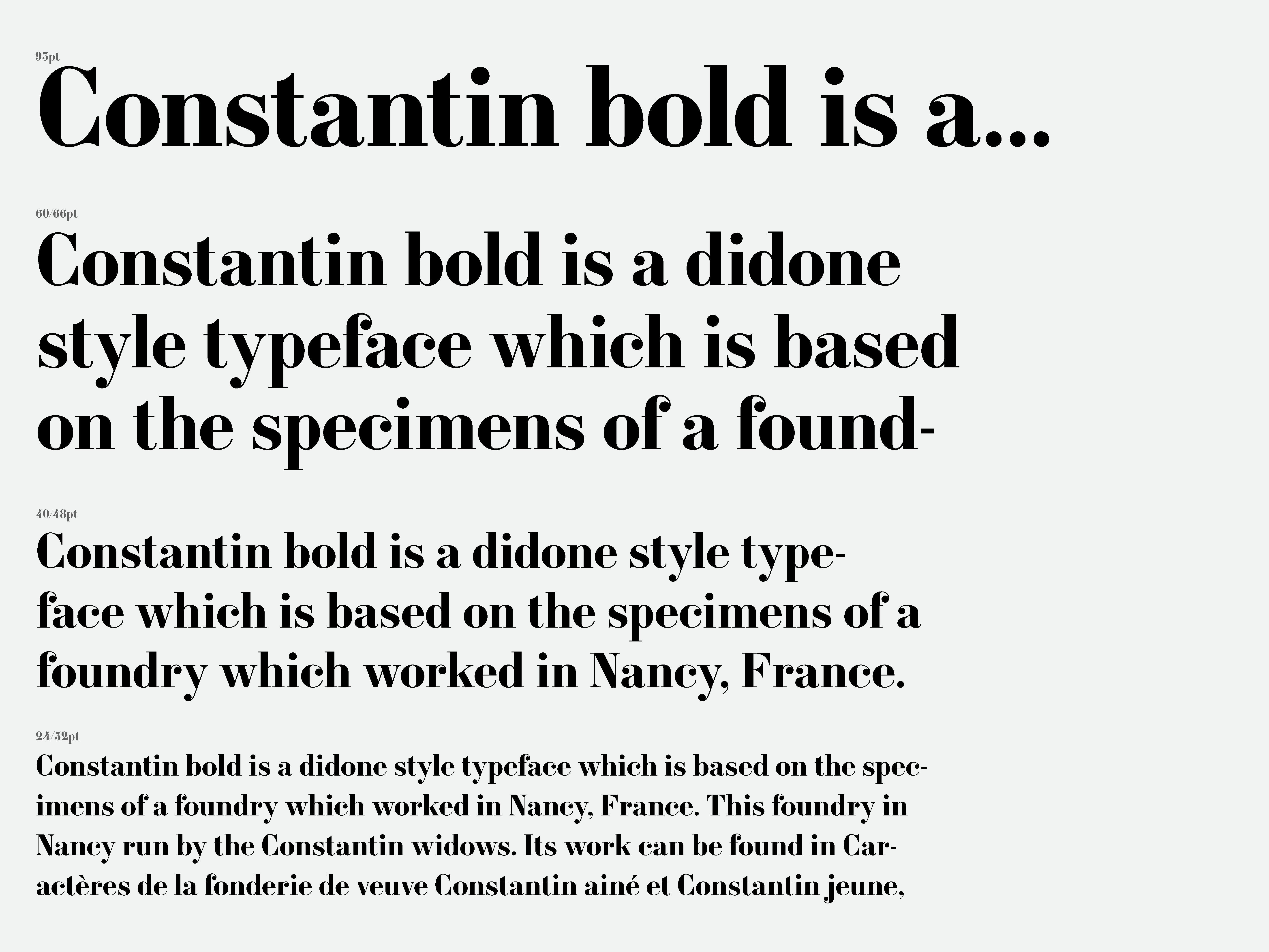
This typeface was originally designed with displays in mind, such as posters. In order to make it applicable to shorter texts and highlights, it was later modified so as to function as a bold weight and heavily contrasted body typeface. The addition of a variety of weights, such as thin, regular, and bold, is still to come.
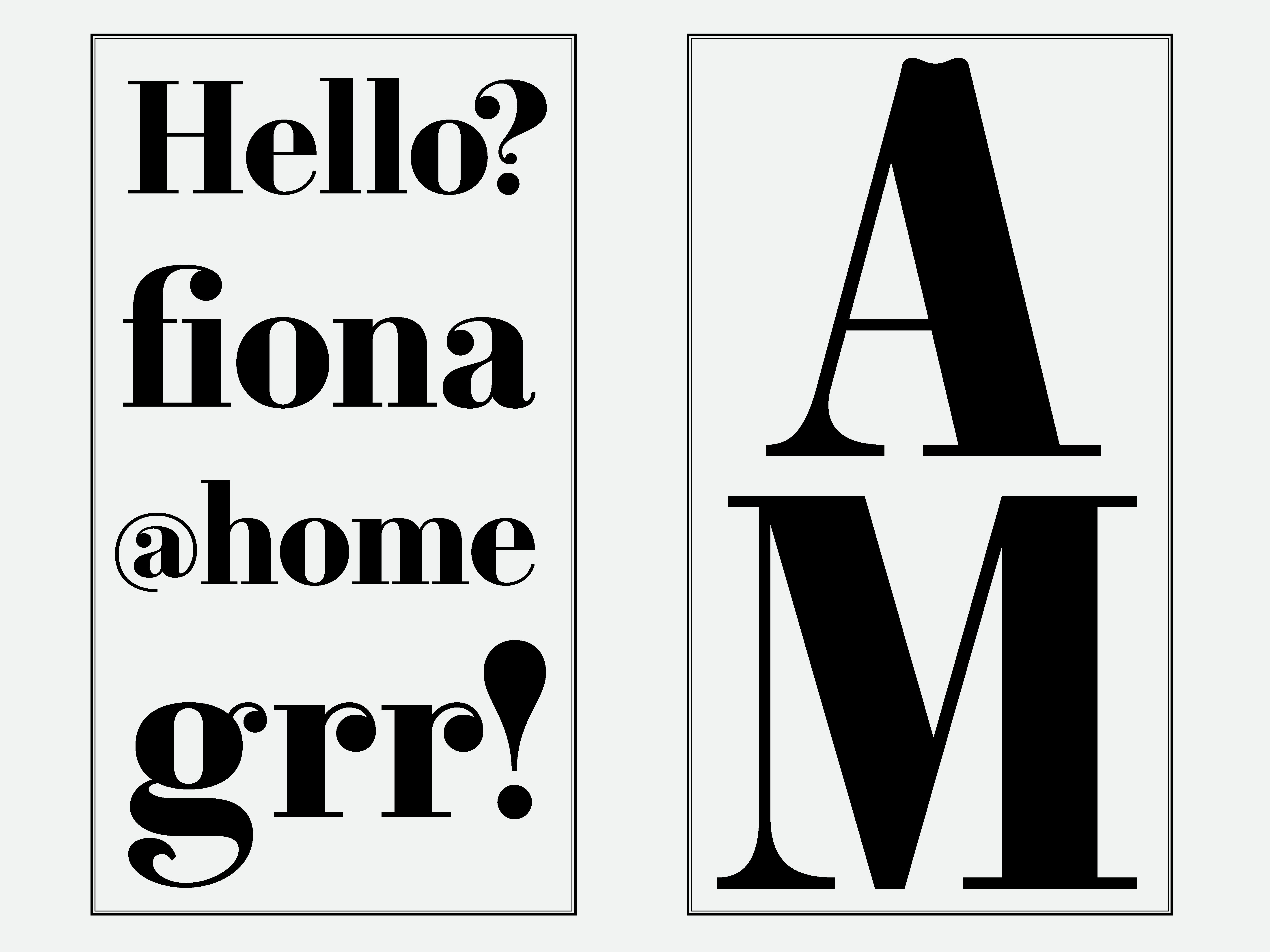
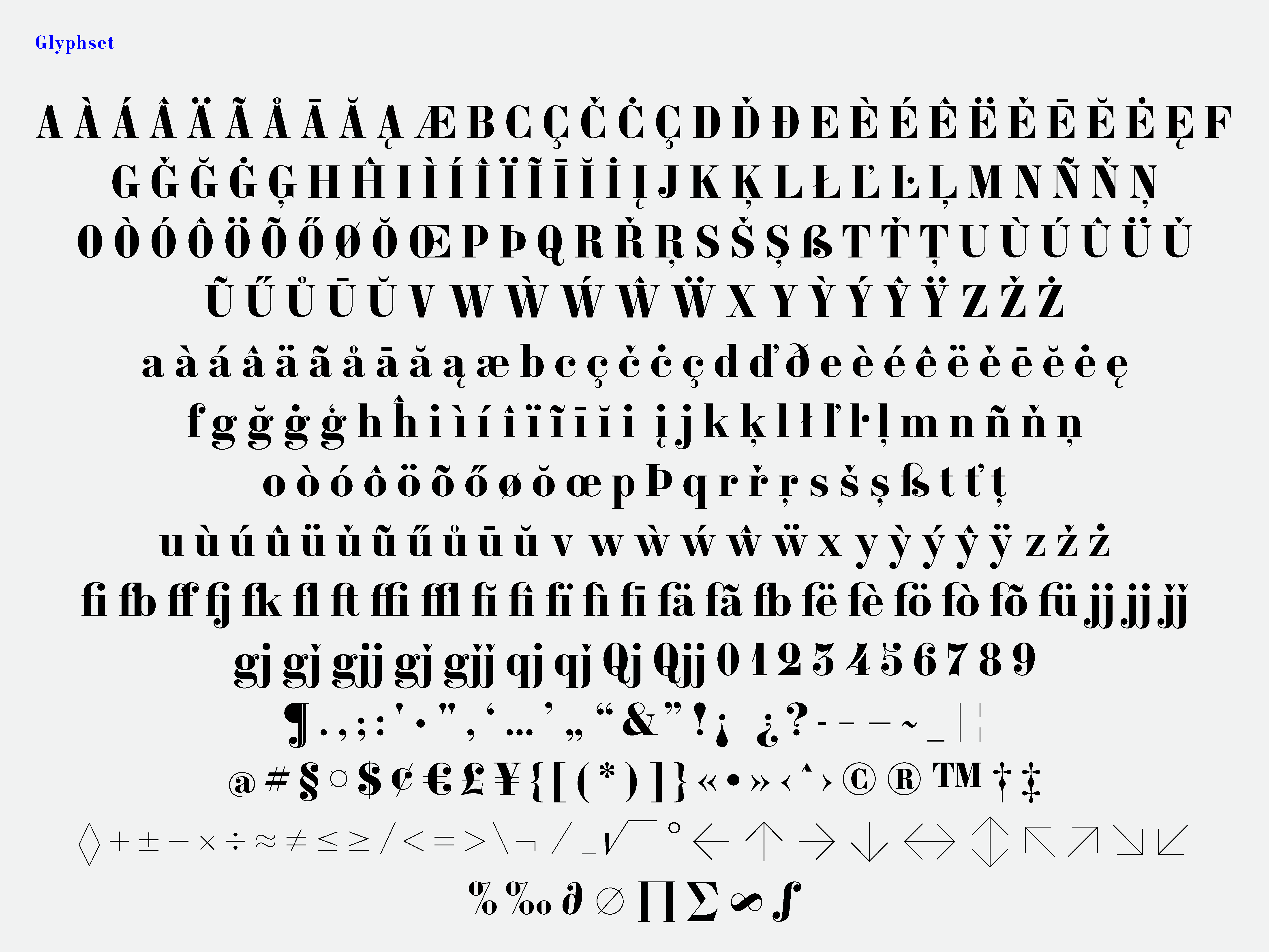
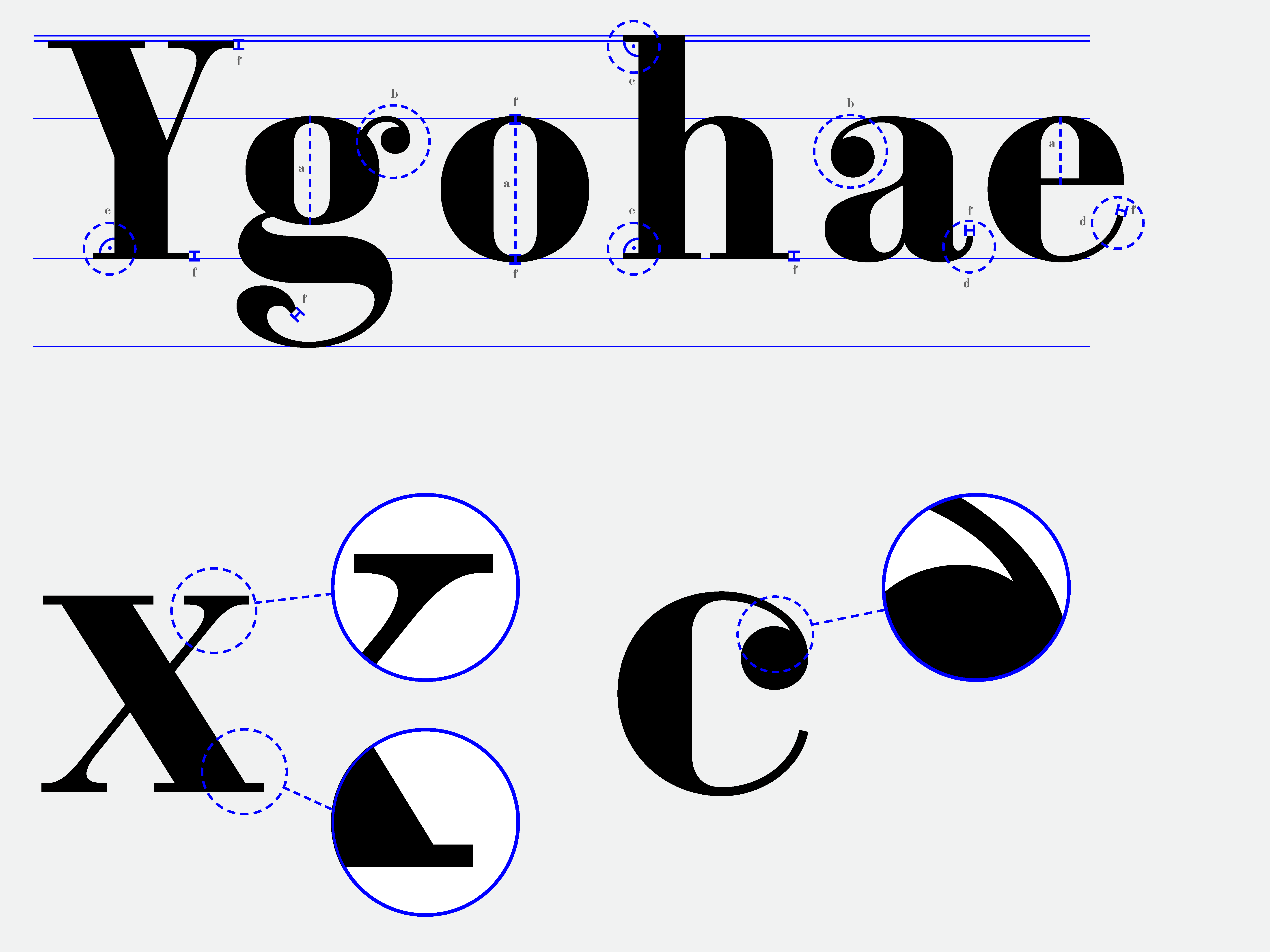
With Constantin being a didone style typface, the axis of the ‘o’ has a precisely vertical stress, as well as that of the ‘e’, ‘g’ and all the round letters. In many cases, the stroke terminals are ball shaped. However, rather than bridging the ‘ball’ and the stroke with a lightly curved arc, the terminal is adjoined in an acute angle, signifying the insertion of the typeface into the digital medium. The contrast between thin and thick lines is abrupt and dramatic, and the width of the thin strokes is always the same and is equal to the height of the serifs. The serifs are un-bracketed and thin. In sum, the typeface was constructed in a systematic and logical fashion: the shapes can be divided into separate groups, creating a coherent system, and rendering the texture vibrant yet legible.