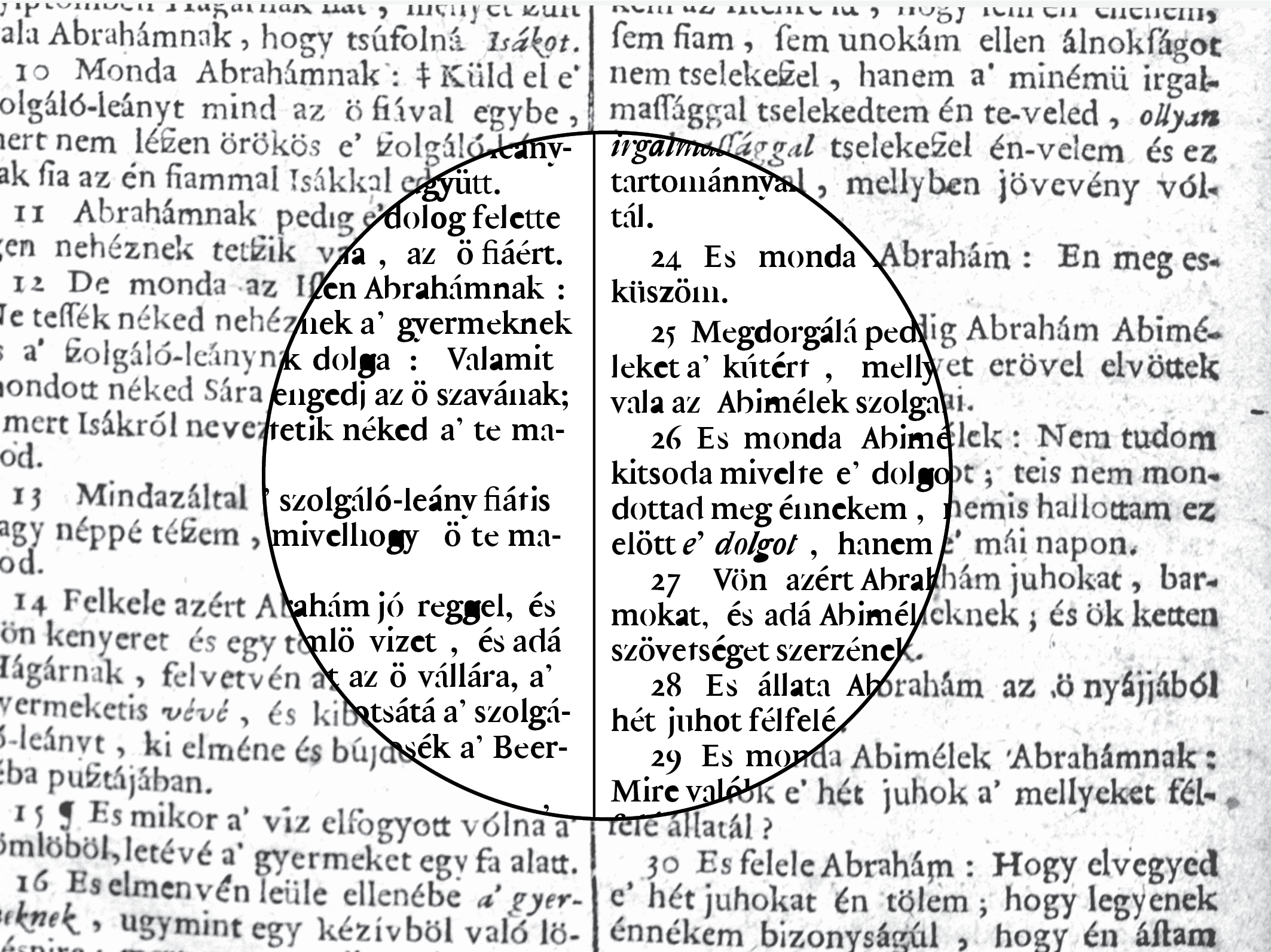
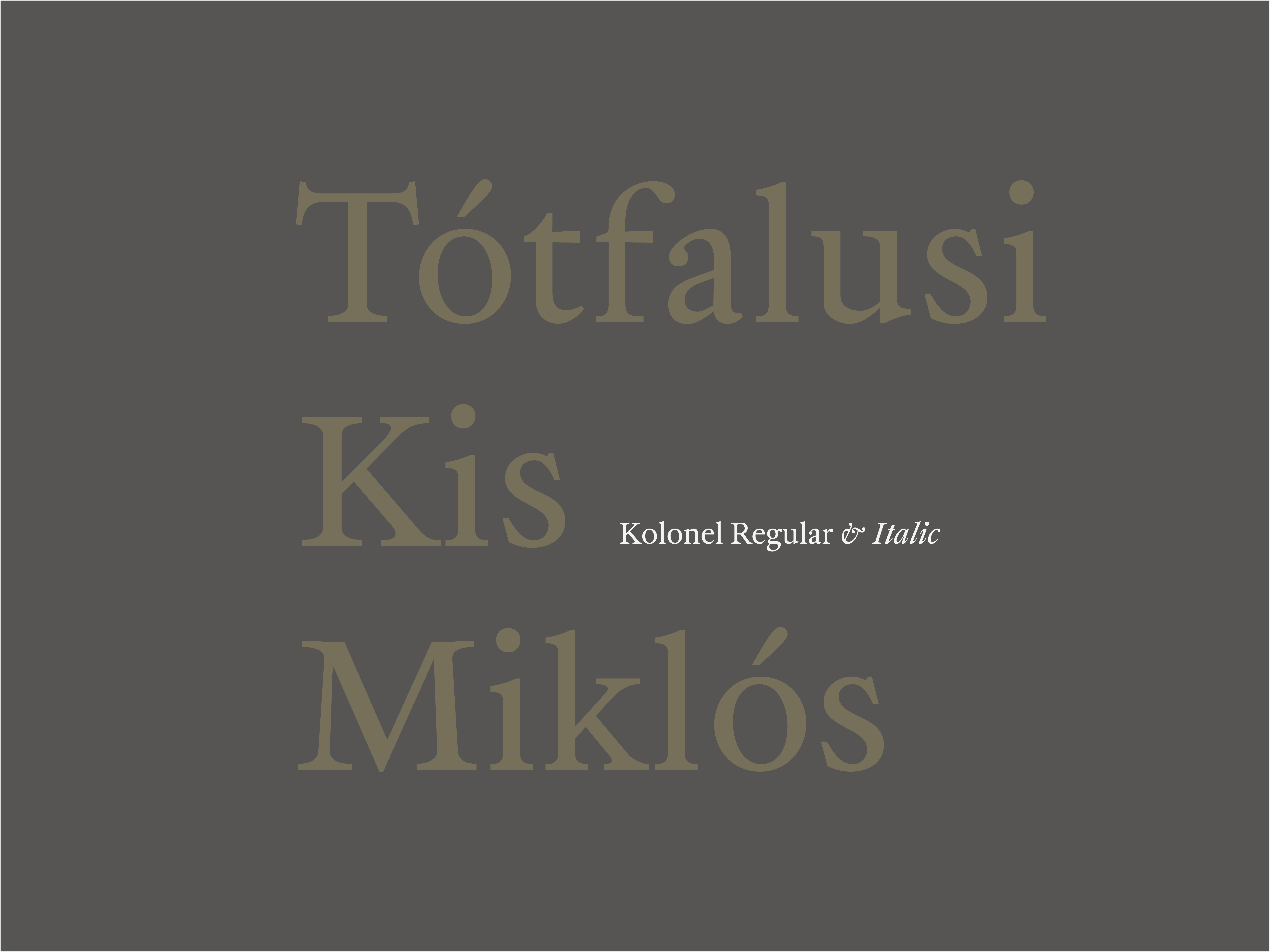
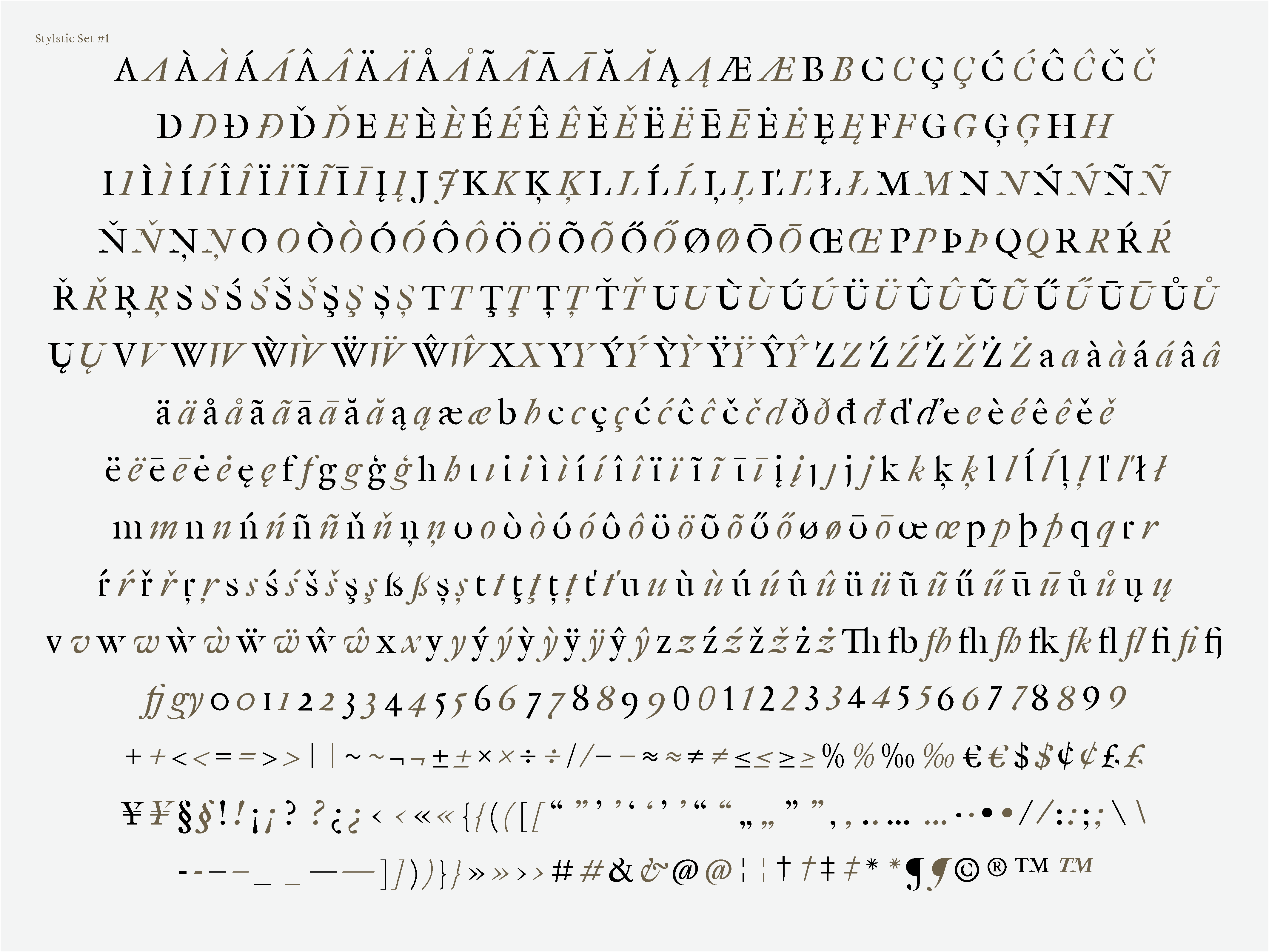
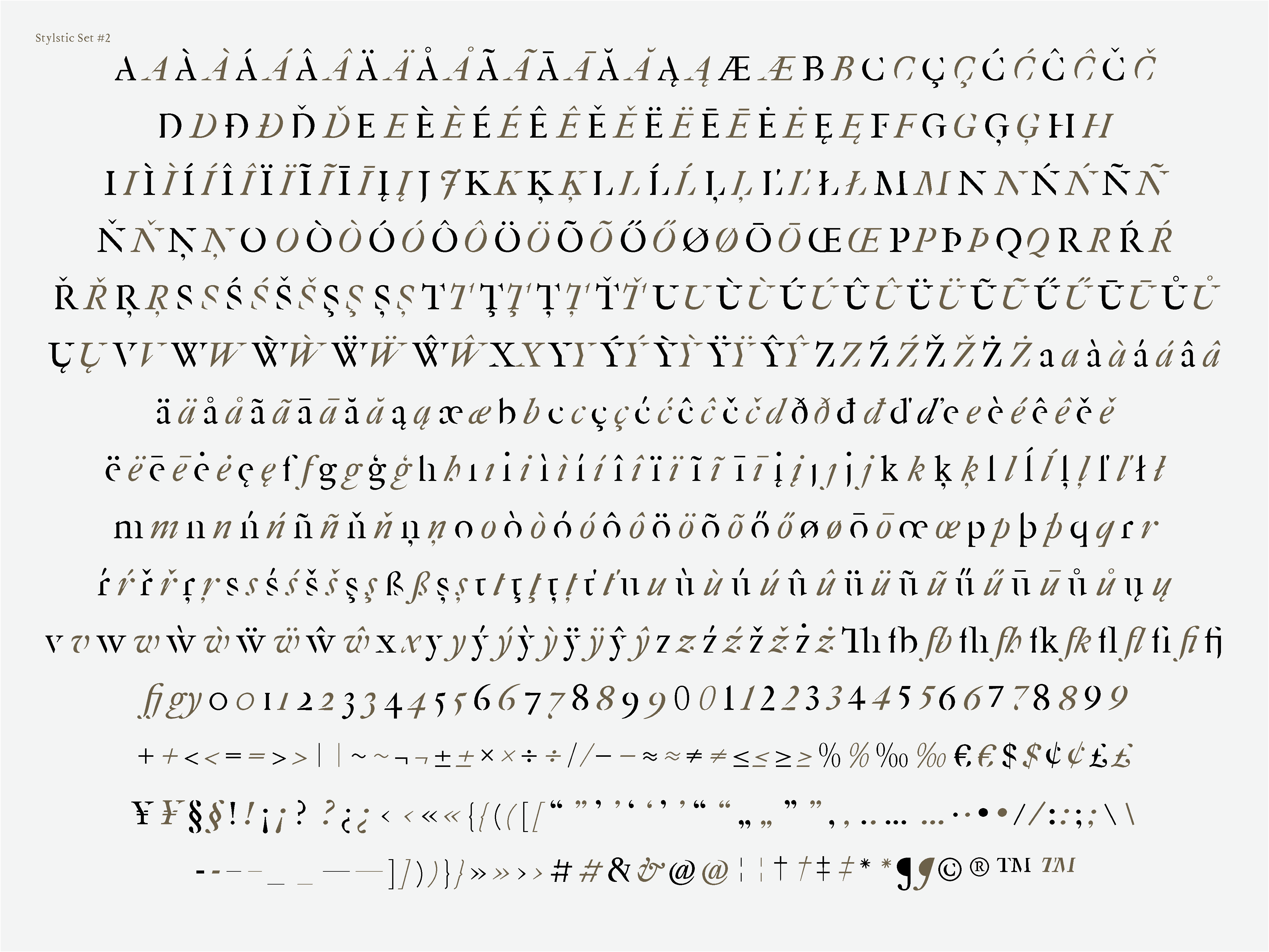
Kolonel is a Dutch oldstyle typeface, based on the letters of Nicholas Kis (Tótfalusi Kis Miklós). Kolonel is based on the 7 pt (colonel) text size which the famous bible of Nicholas Kis is printed in (1685, Amsterdam).
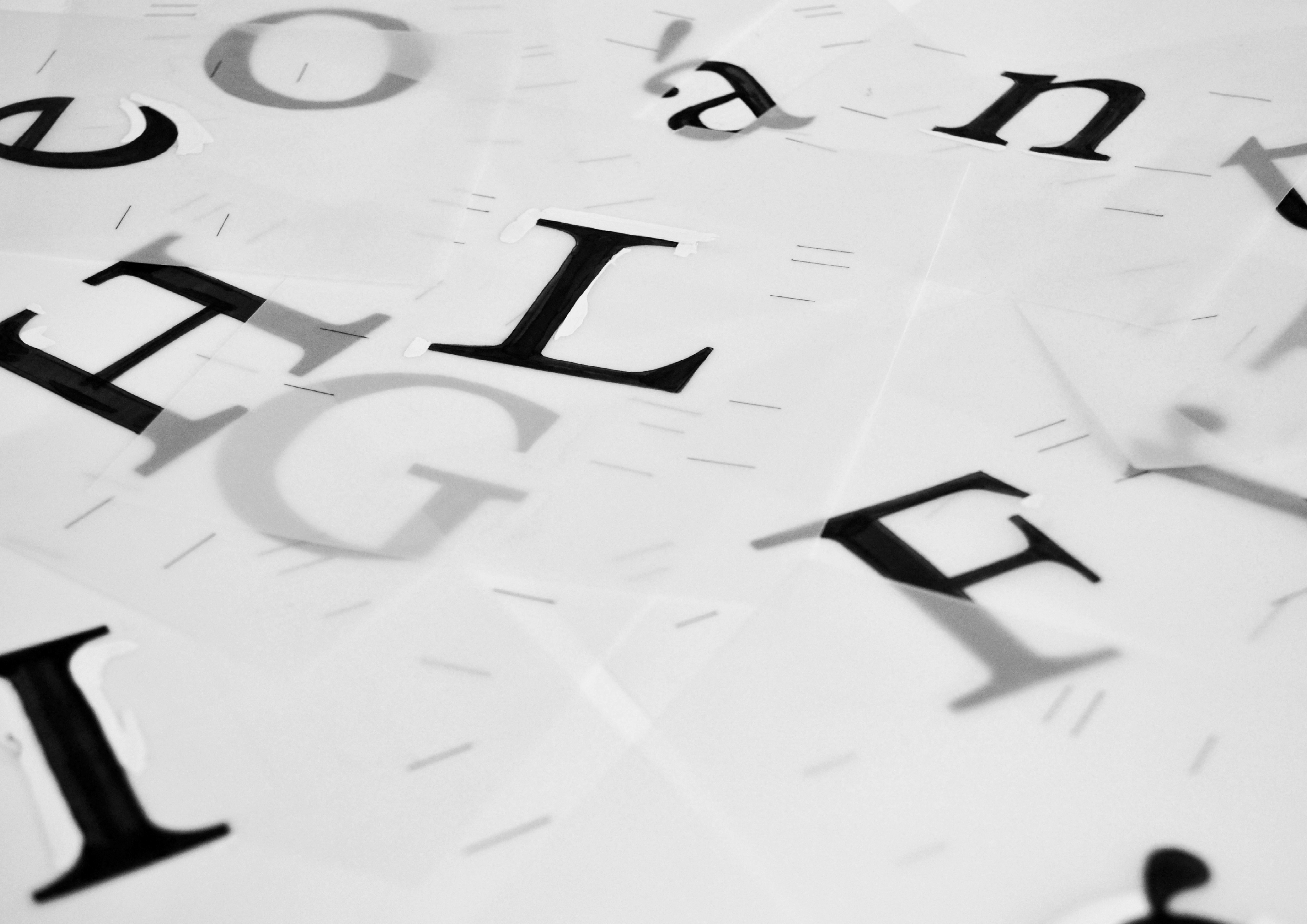
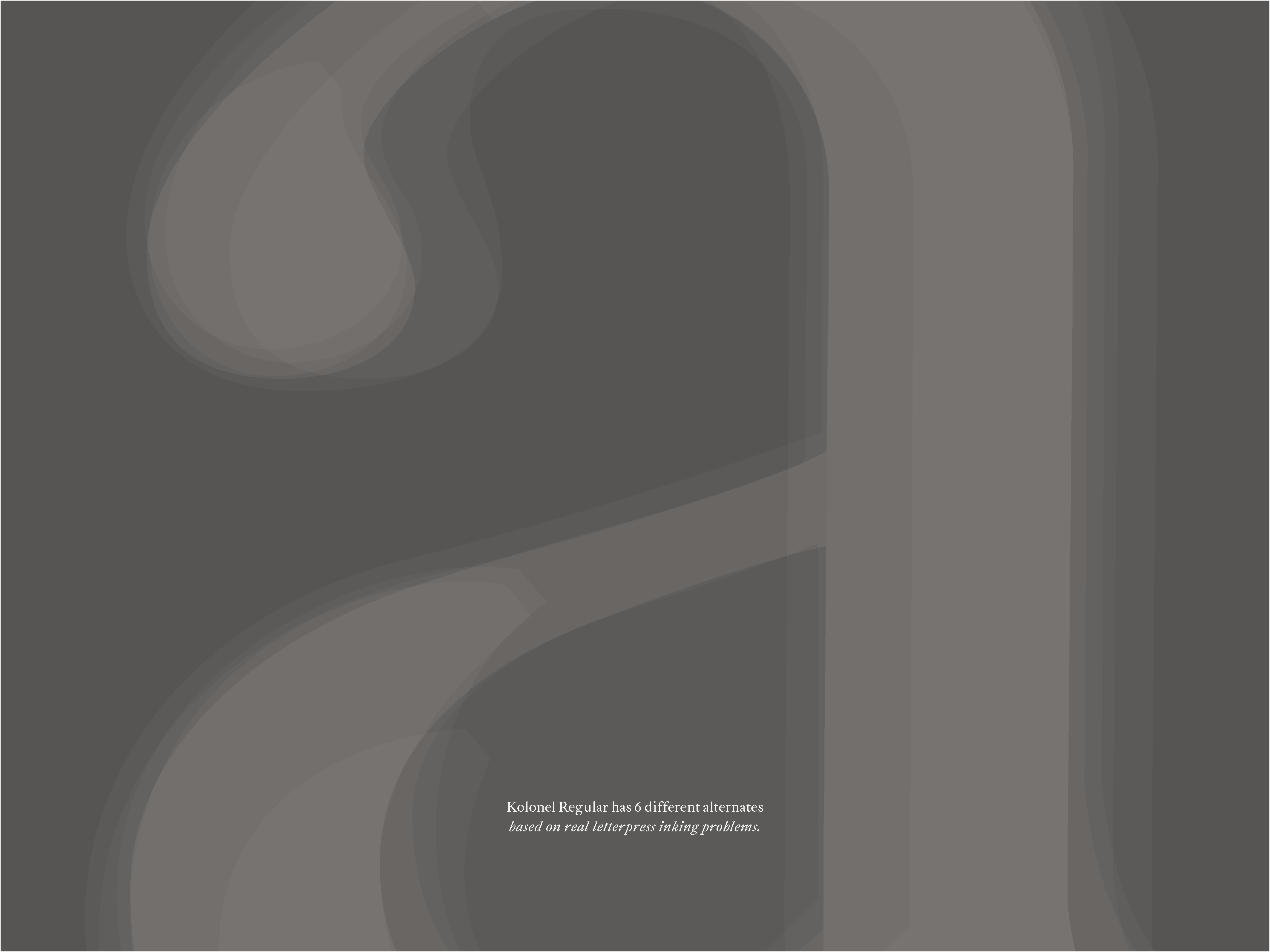
This typeface is also an experiment and was my research project at ANRT. The project endeavours to find a way to bring back the lively feeling of the letter press printed text to the digital medium. I was experimenting with creating different alterations of each letter, based on real inking problems, which I founded on Kis’s bible.
Even though I used sophisticated programming technics and variables for the shapes, I didn’t do it with the intention to achieve some kind of progress, but quite the opposite, my aim was to resuscitate something that has been lost in (printed) texts since the disappearance of analog printing techniques.
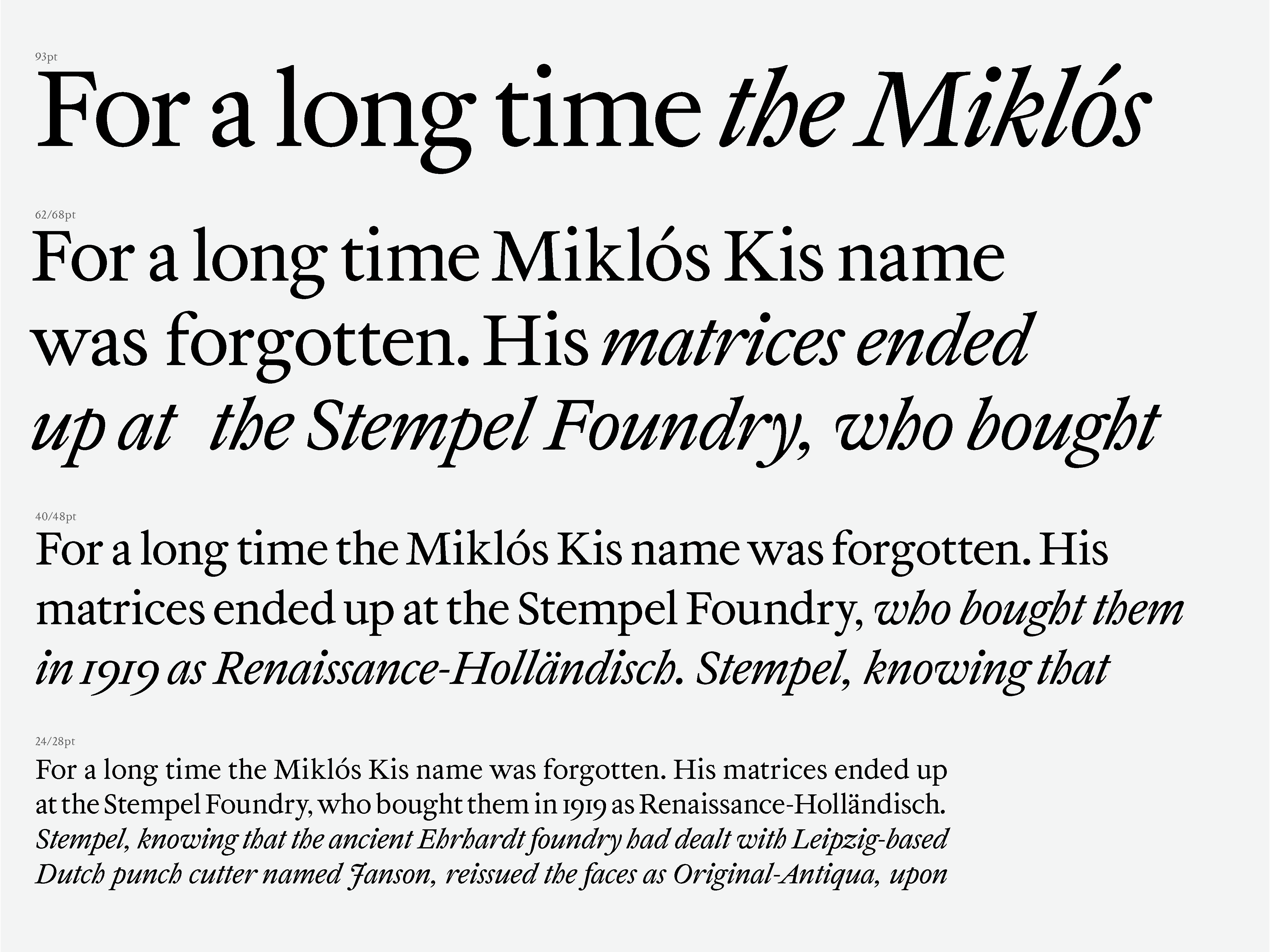
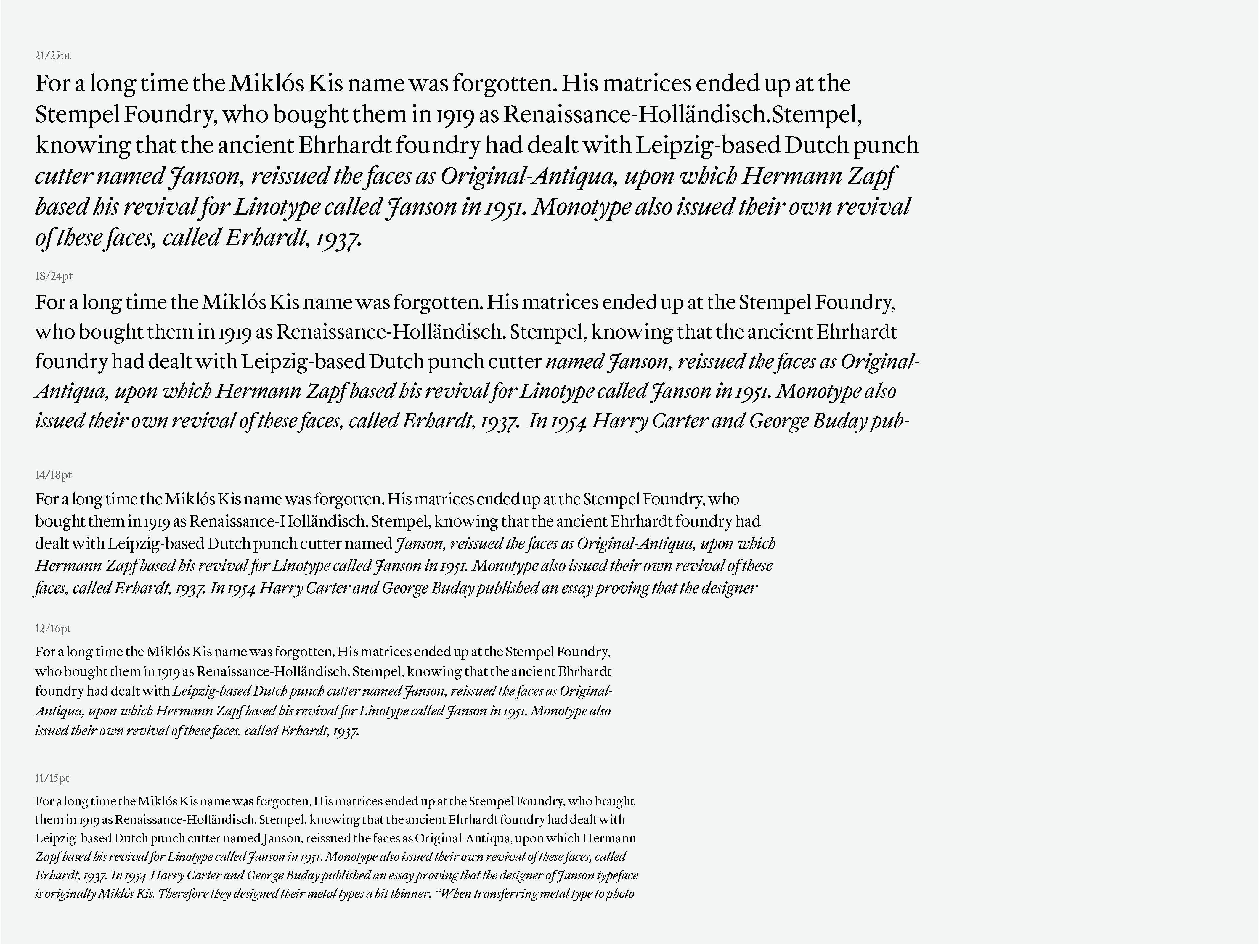
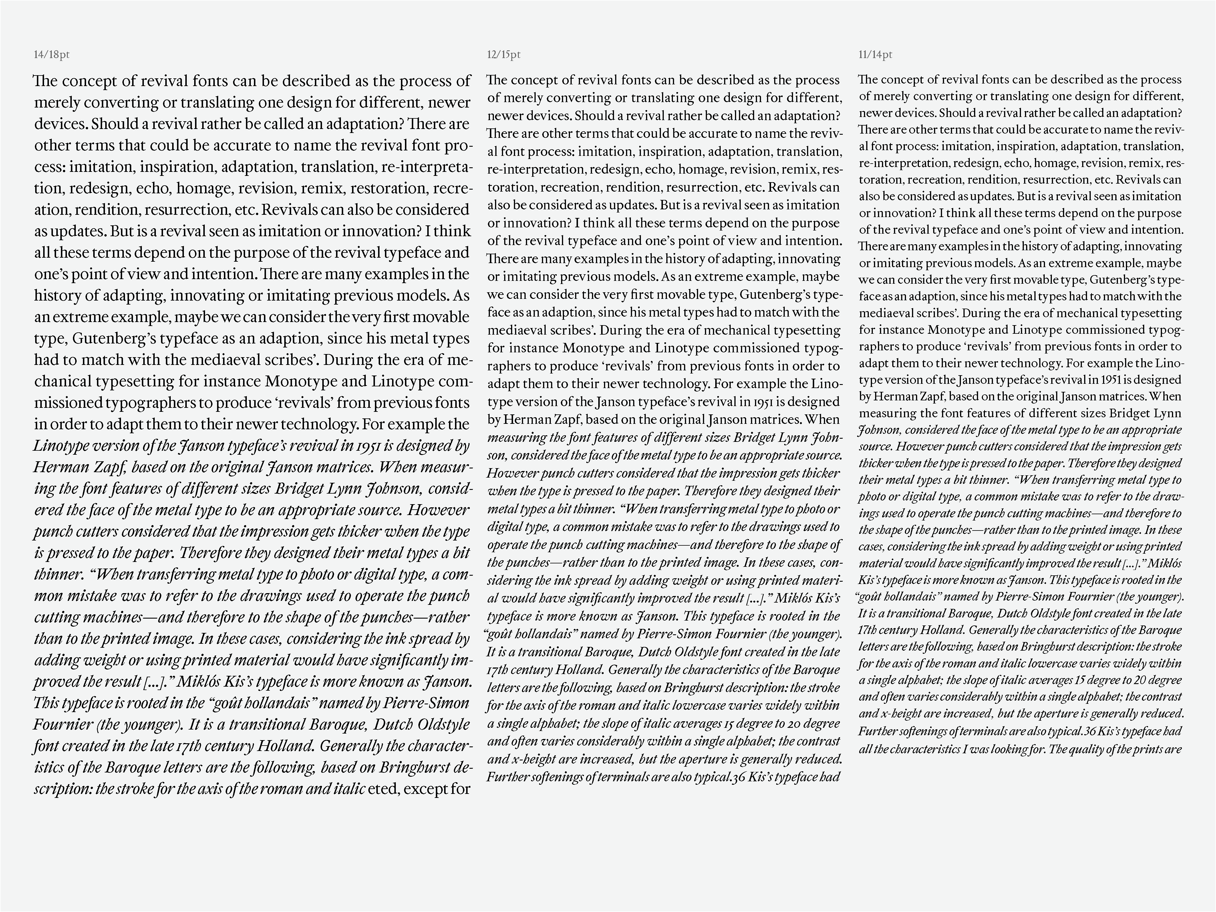
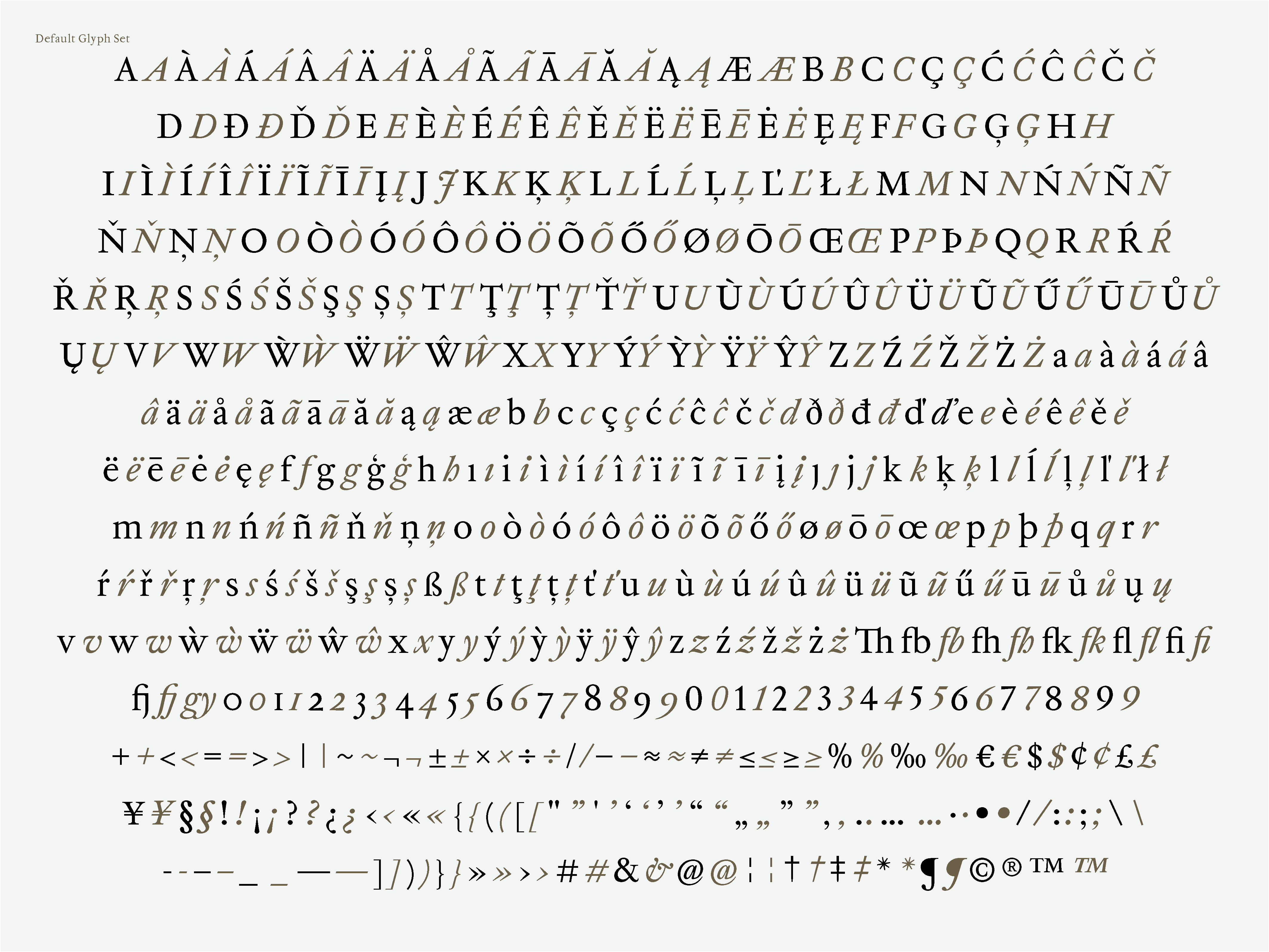
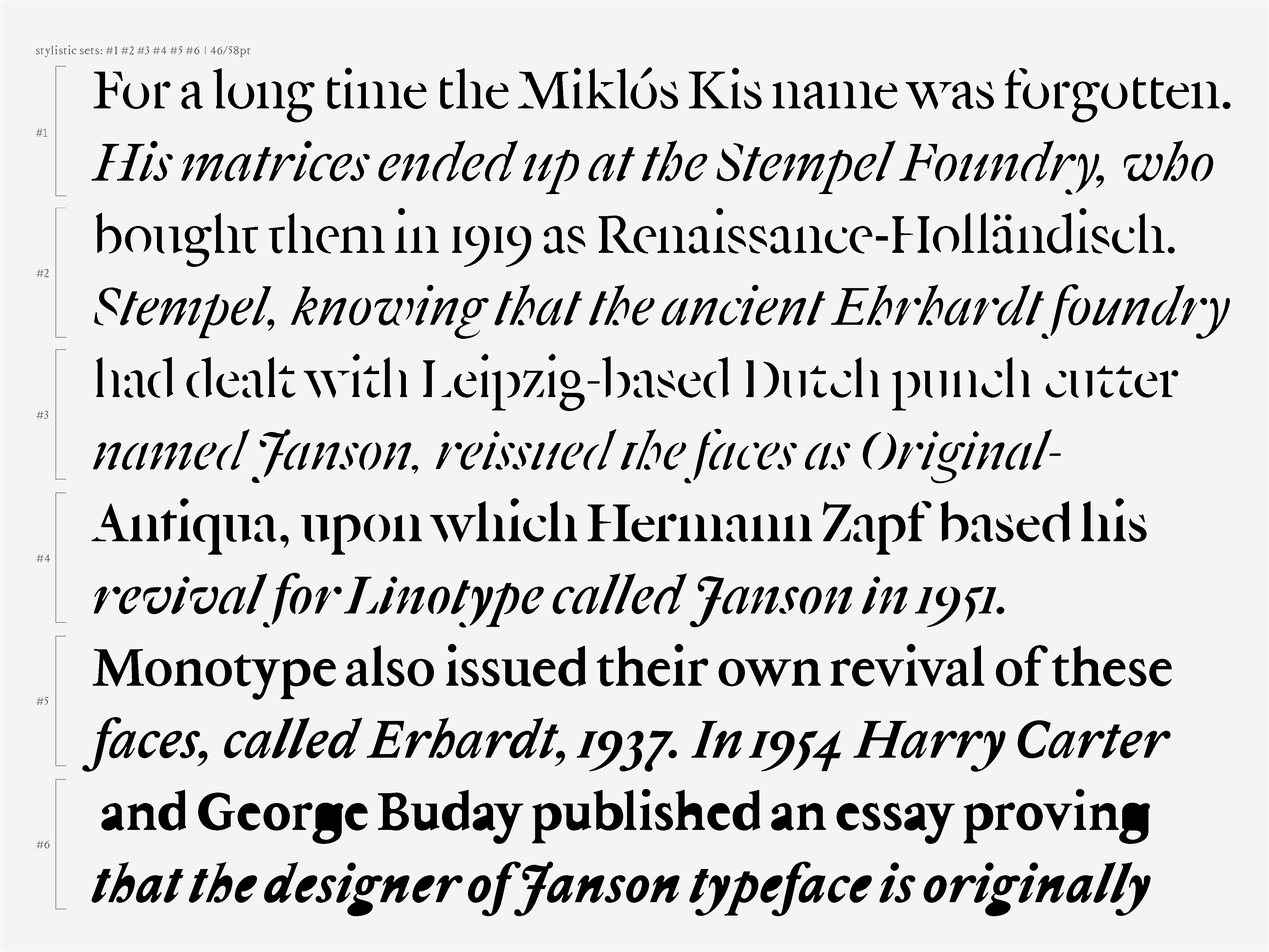
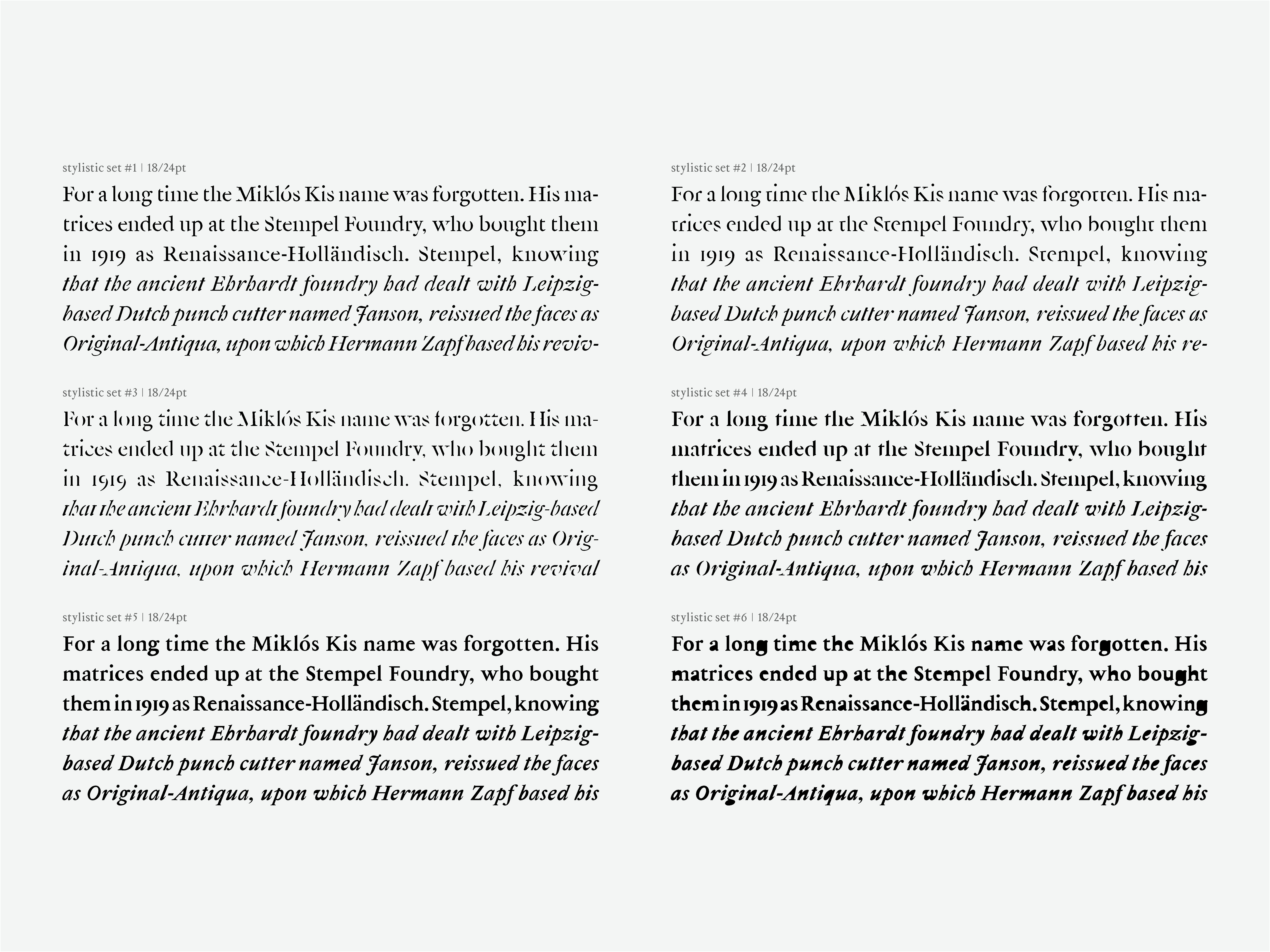
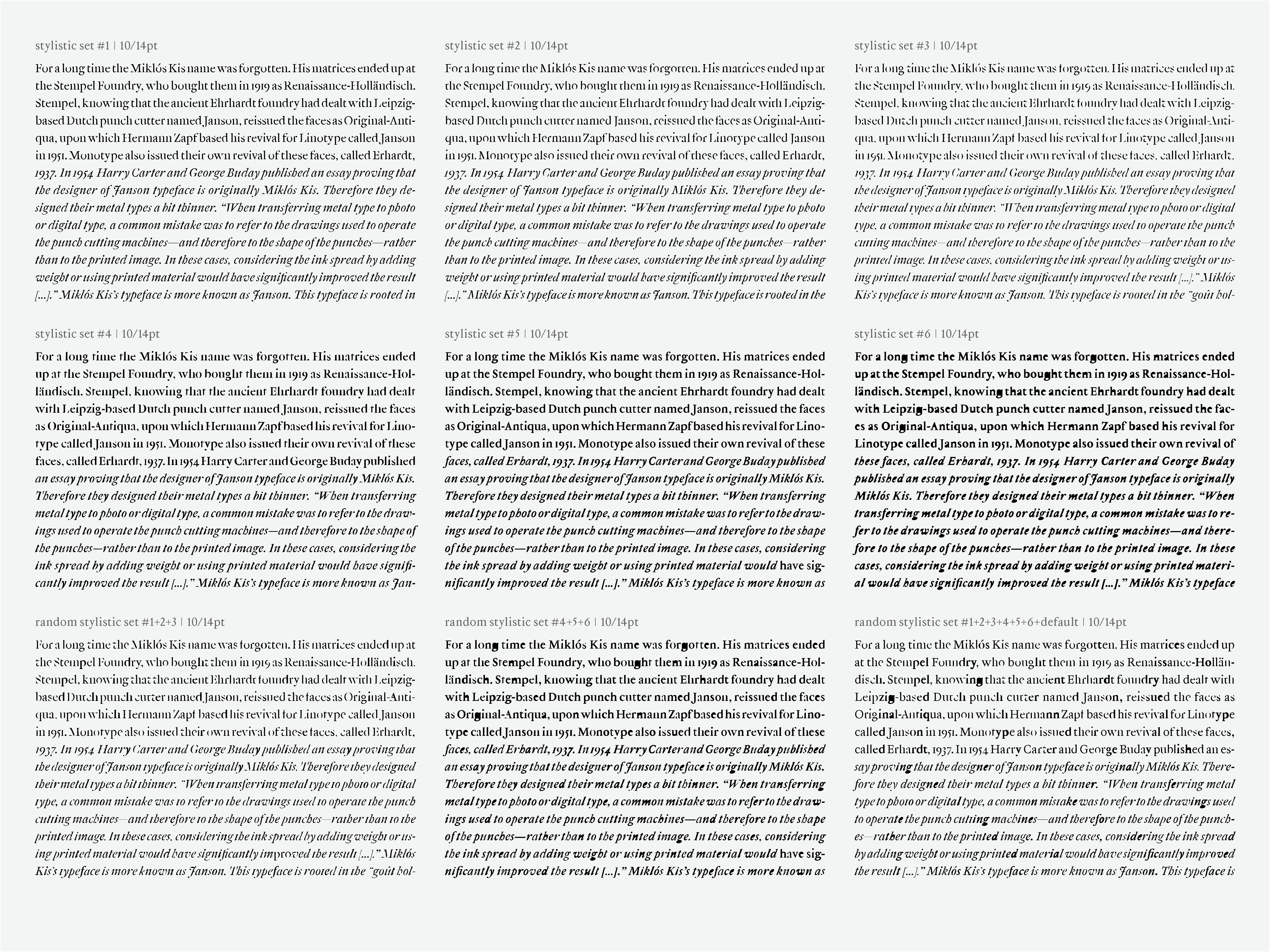
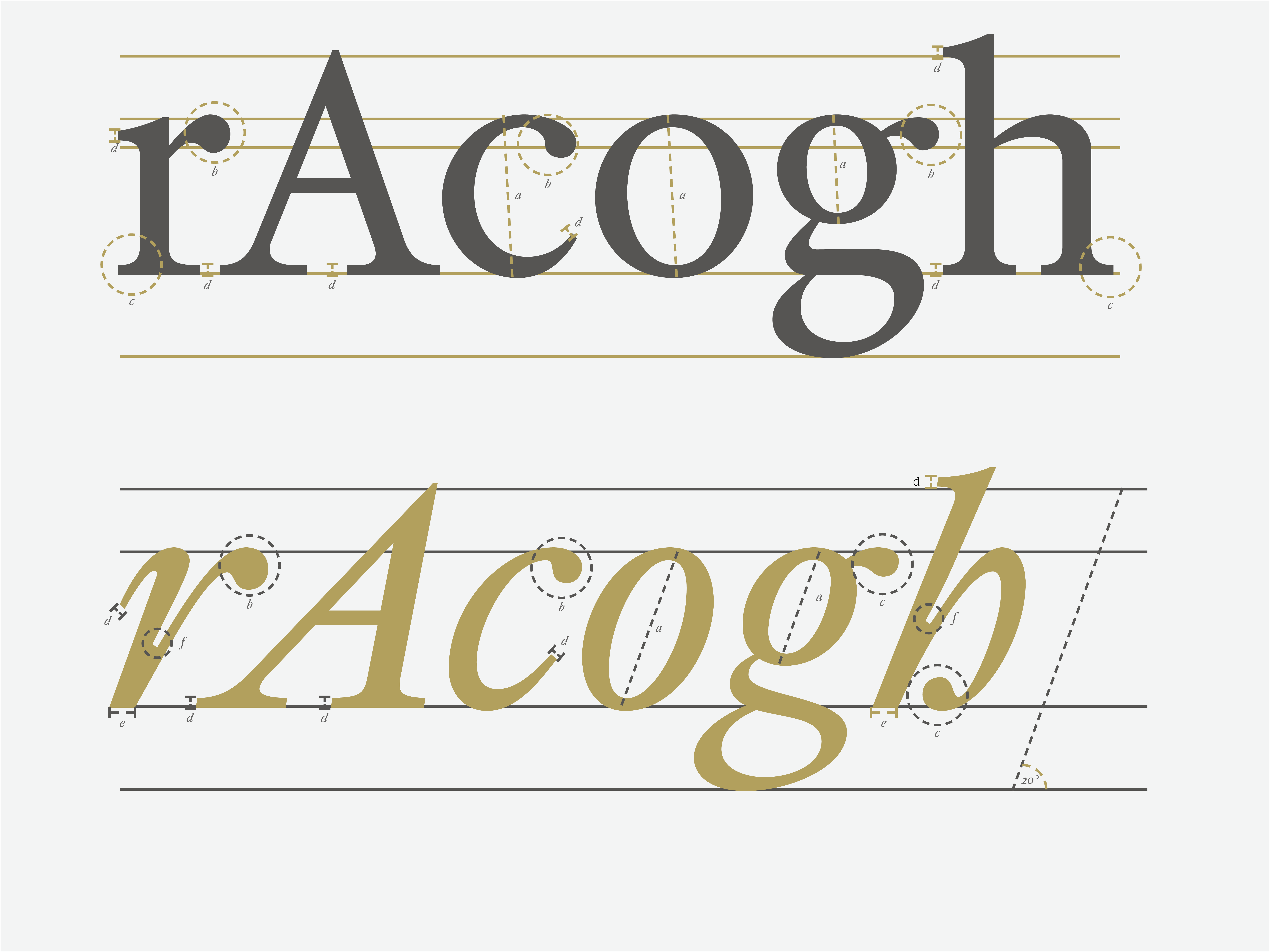
With the bracketed serifs and the slightly slanted axes of the ‘o’ ‘c’ and ‘e’, the typeface’s Dutch oldstyle baroque (transitional) characteristics were preserved. The contrast between the horizontal and vertical lines are present, but soft. The teardrop endings and slightly narrow shapes of the curves on the ‘n’ ‘m’ and ‘h’ reflect the typical Dutch style. The thickness of the lines was kept slightly emphasized both in the regular and italic version to reflect the original 7pt size, however, the intention was to make Kolonel well-suited for longer texts in the reading sizes of 9-11pt.
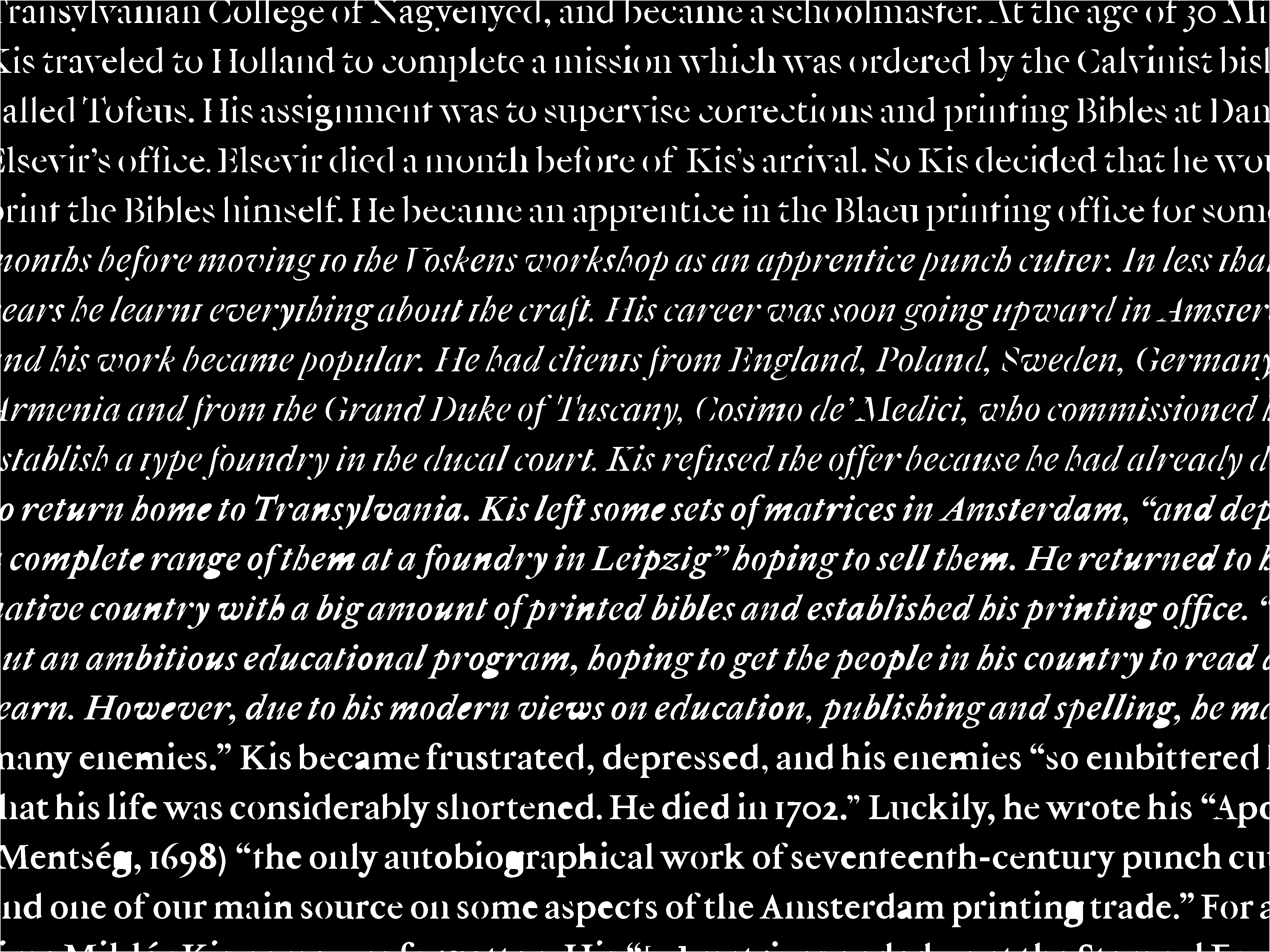
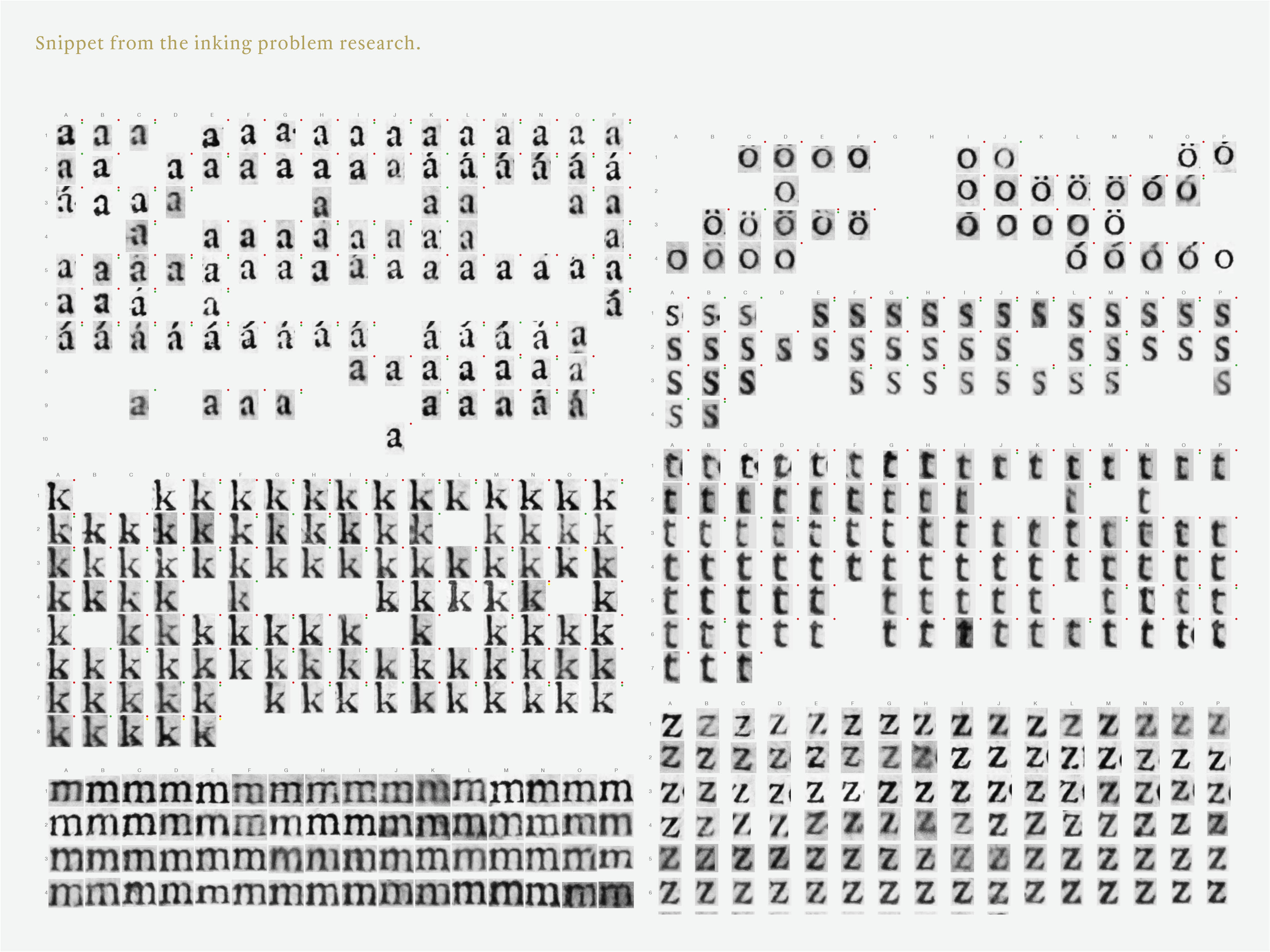
After finding the source (Kis’s Bible), then documenting and taking close-up pictures of its pages, I managed to create a system by classifying the letters from the pages: I examined the printing errors in all the letters, and attempted to categorically fit these errors into a coherent system.