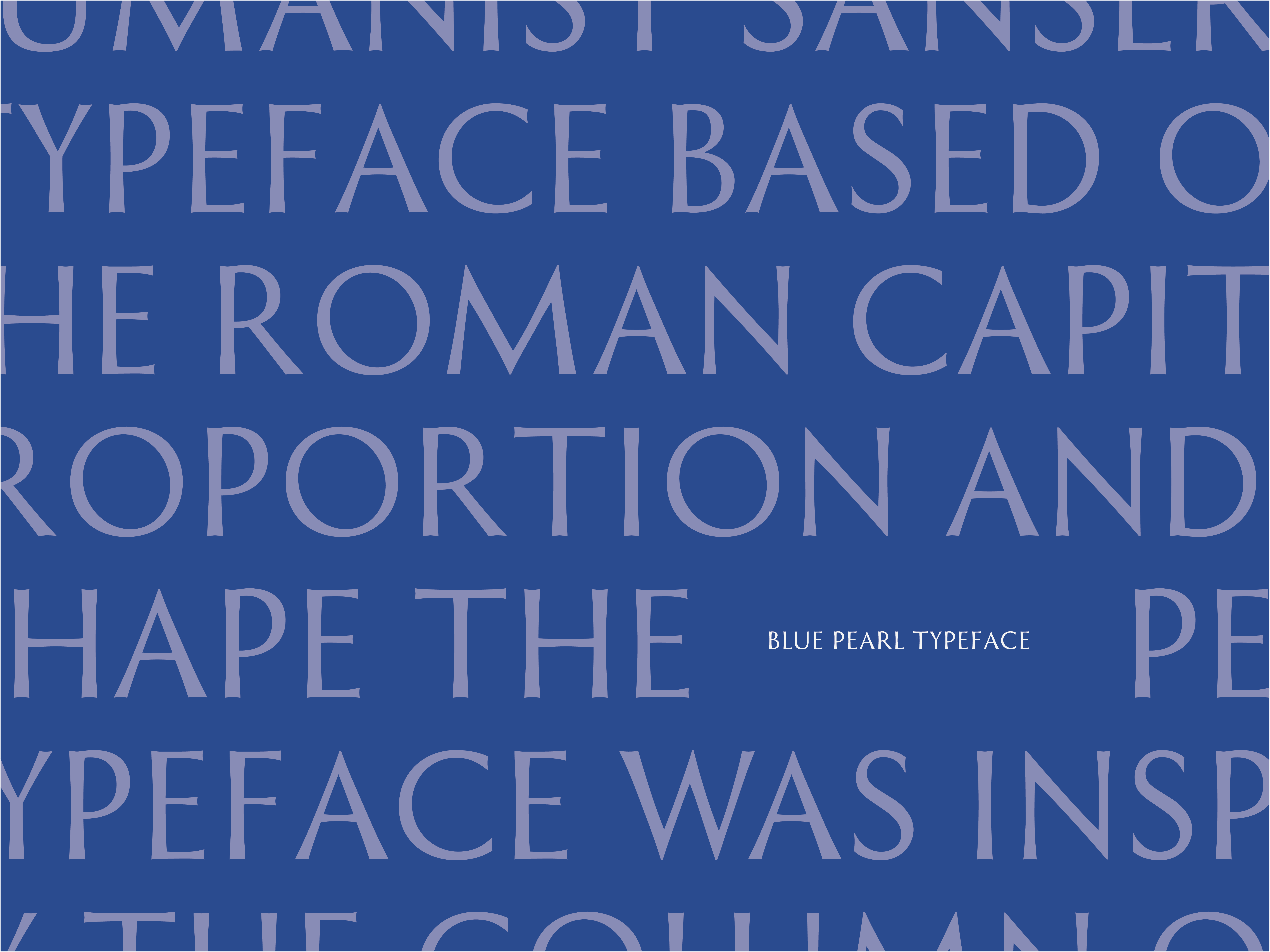
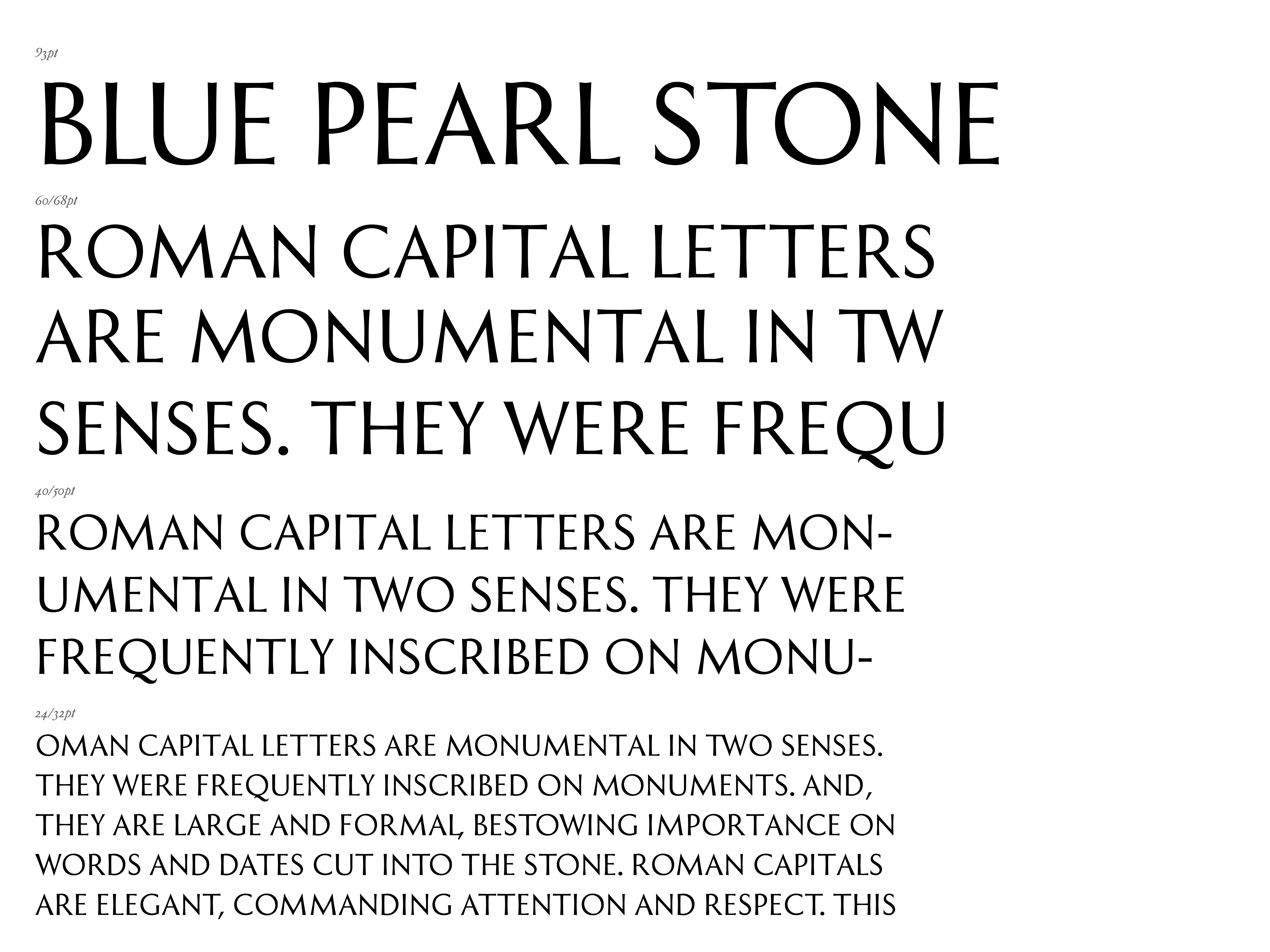
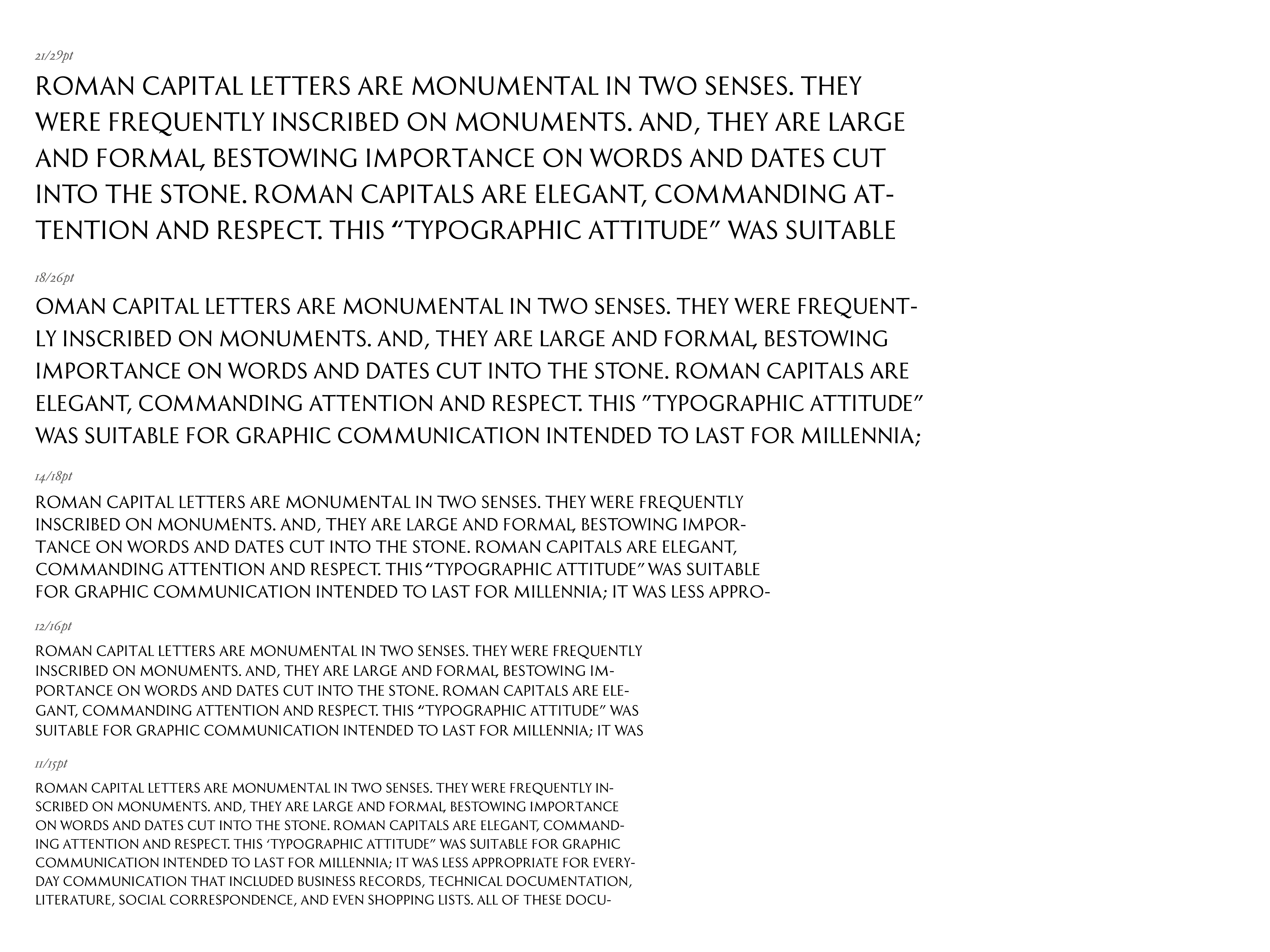
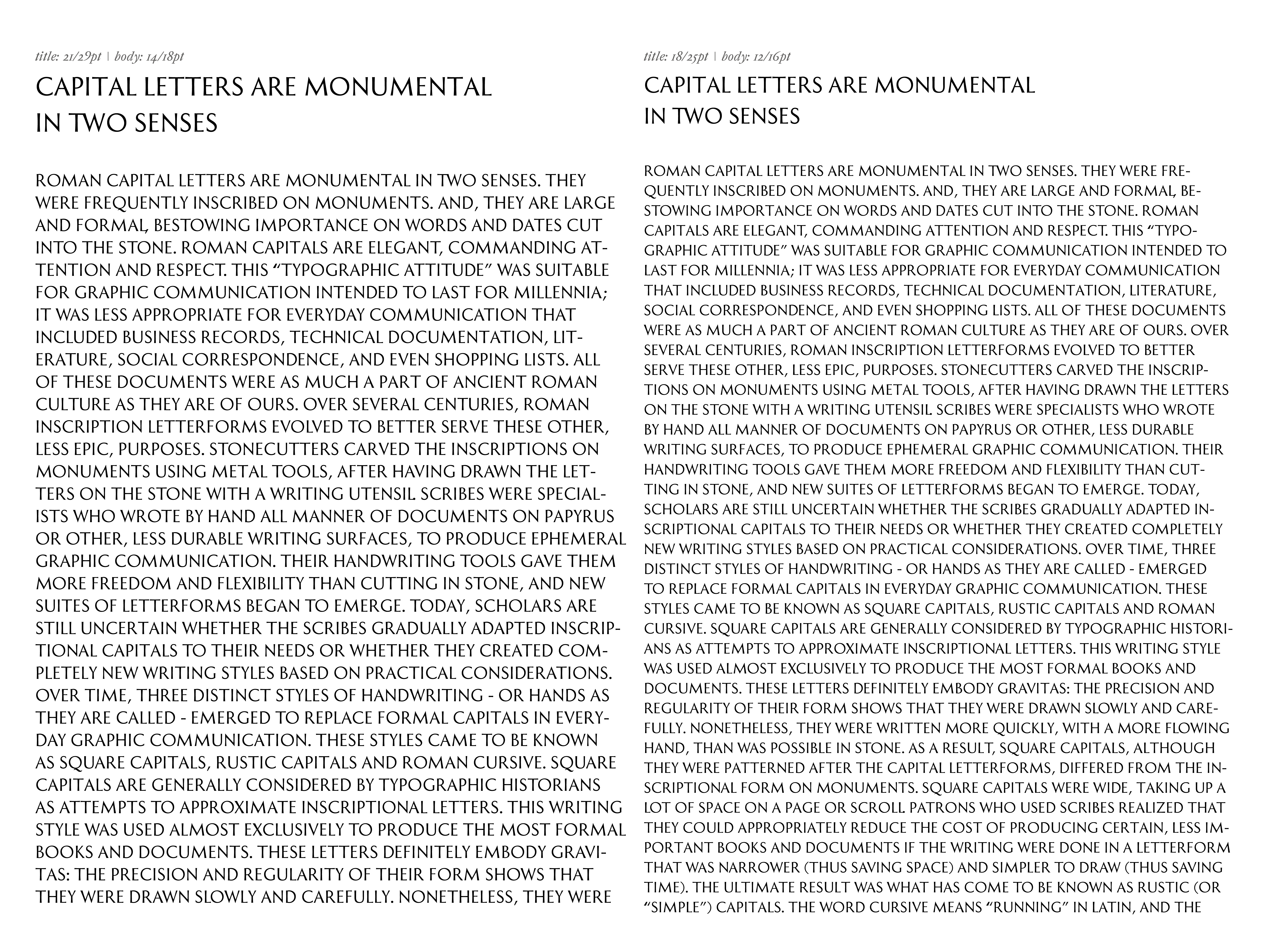
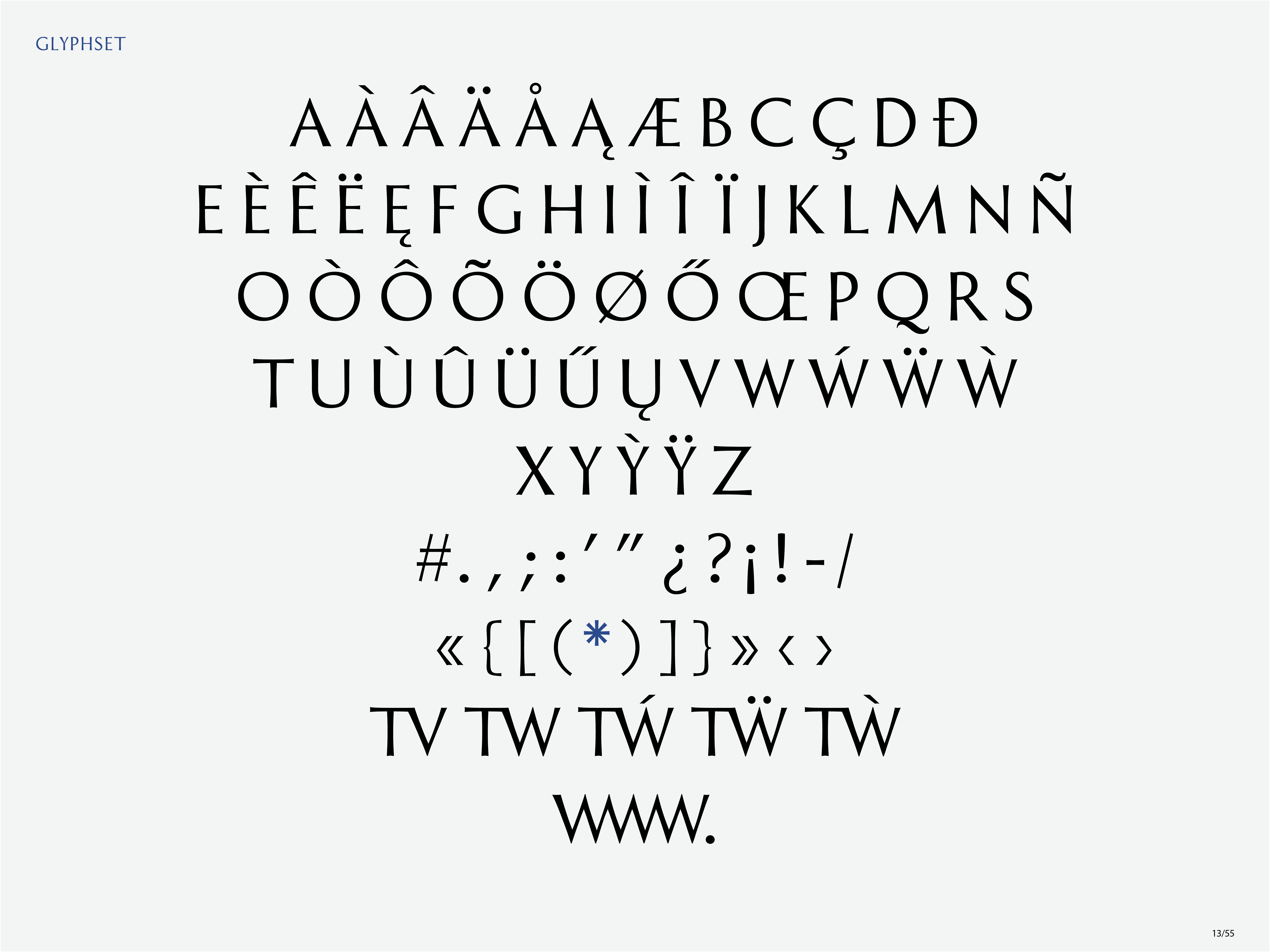
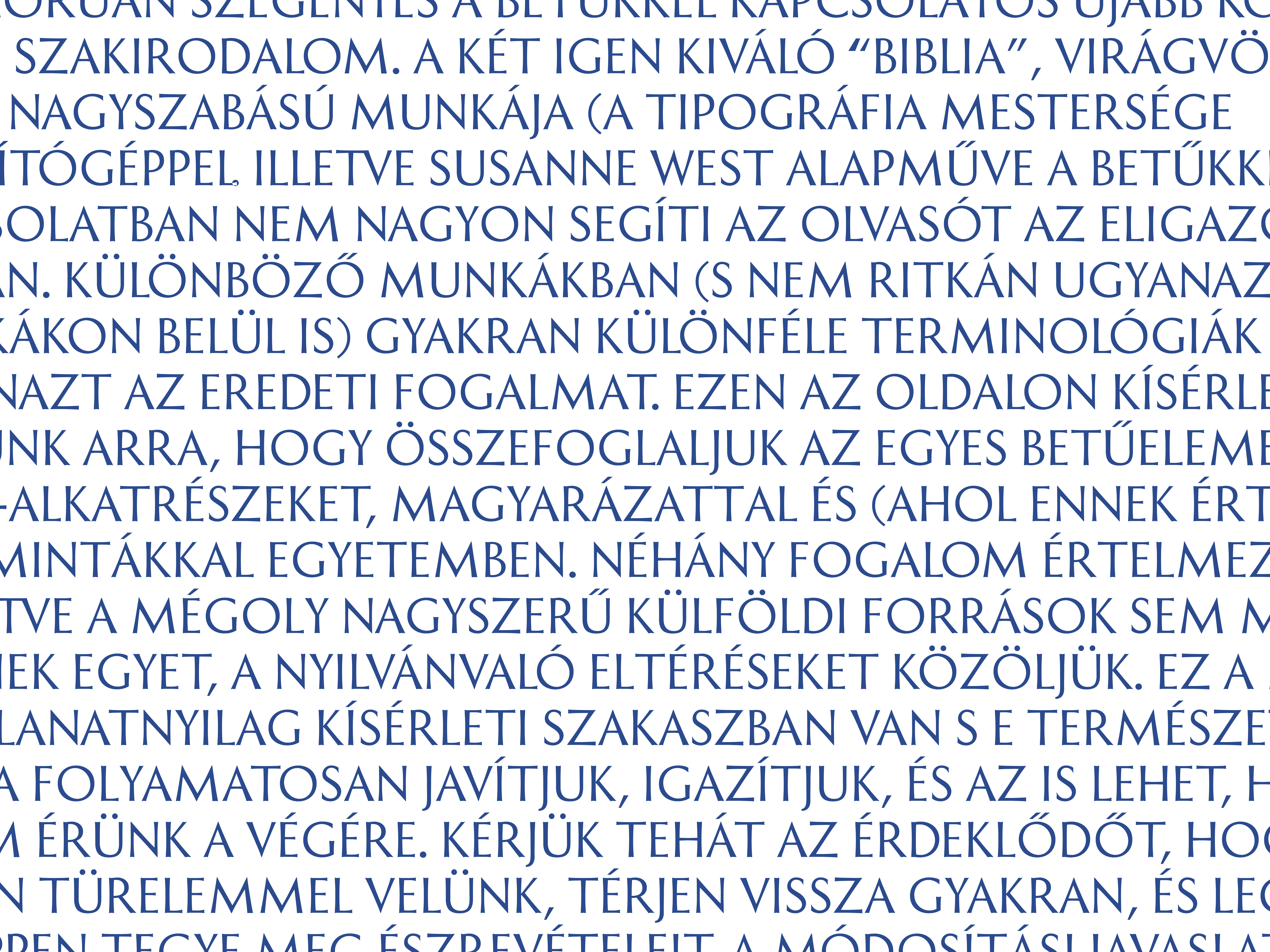
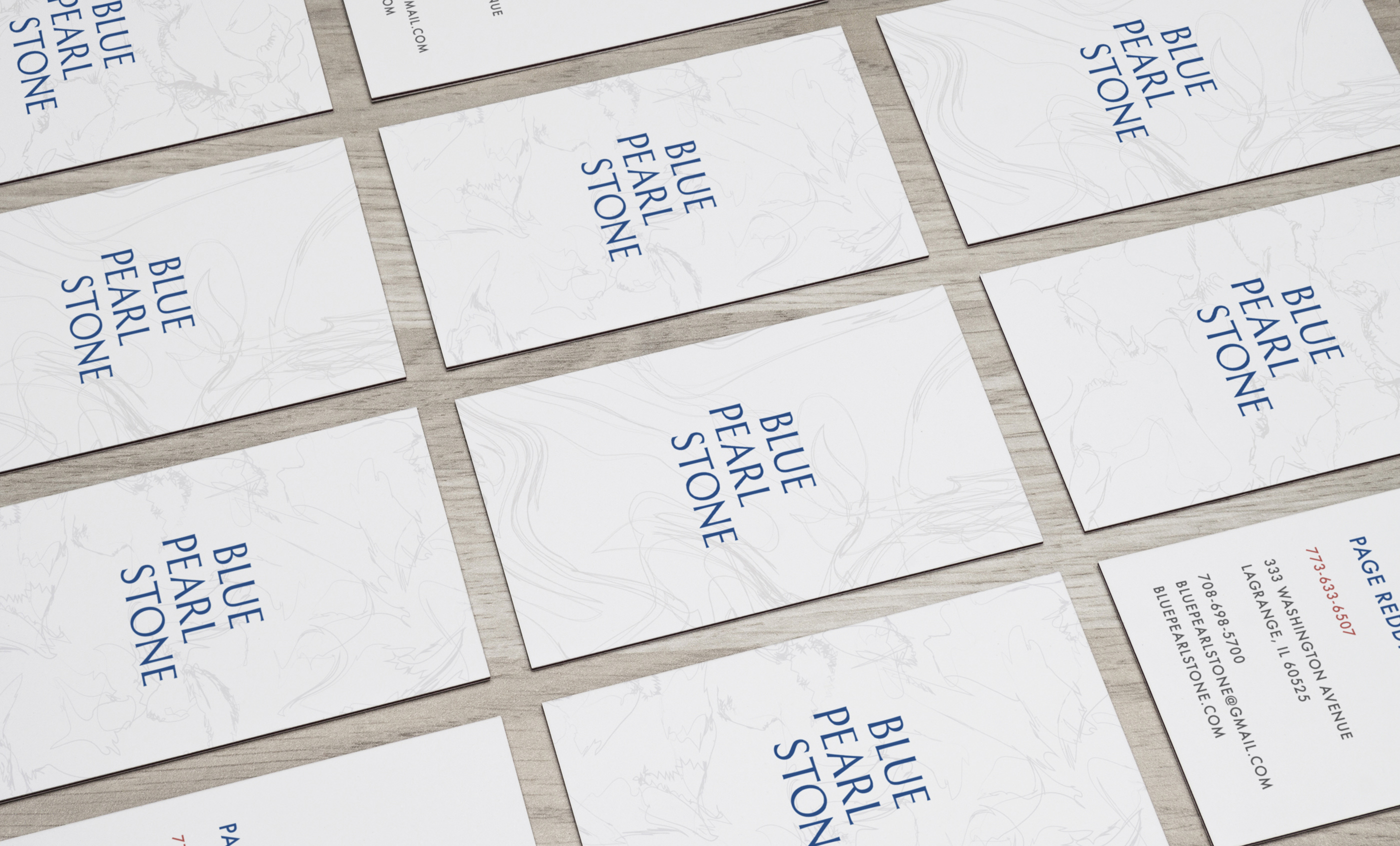
Blue Pearl is a custom typeface, a humanist flared sanserif typeface based on the proportions and shapes of the Roman capitals. Currently it consists solely of capital letters, as it was originally designed for a company logo. Since then, punctuation marks and diacritics have been added. While it was intended for brief content, it does work in blocks of texts when kept to a small font size.
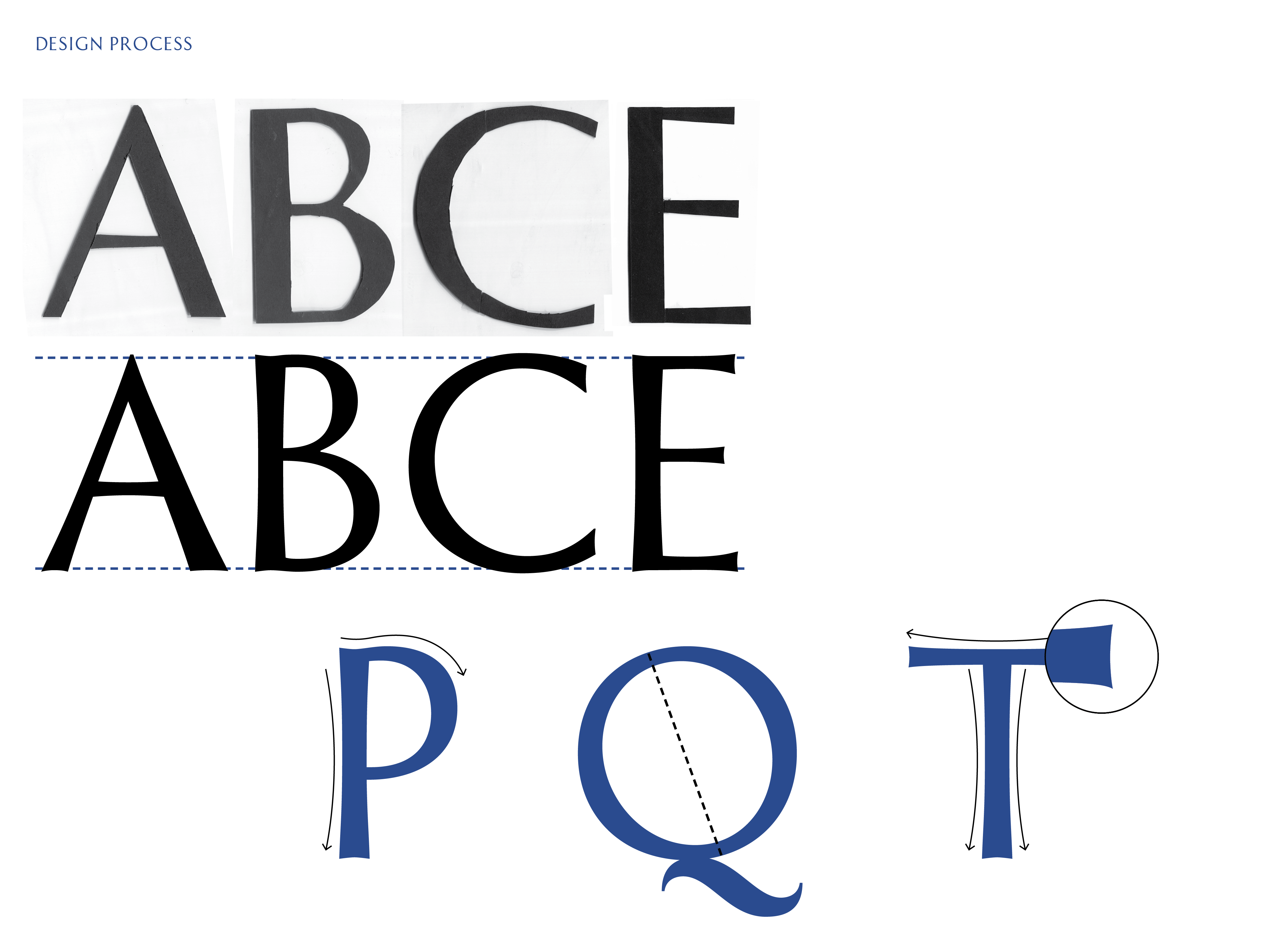
After practicing the calligraphy with a brush, the letters were cut out from paper. This experimental method allowed me to shave off the unnecessary bits, yet still retain the elements that lend the letters their unique identity. After scanning the cutouts, the letters were redrawn in a font software. Finally, multiple phases of testing and nuanced adjustments led to the current state of the letters.
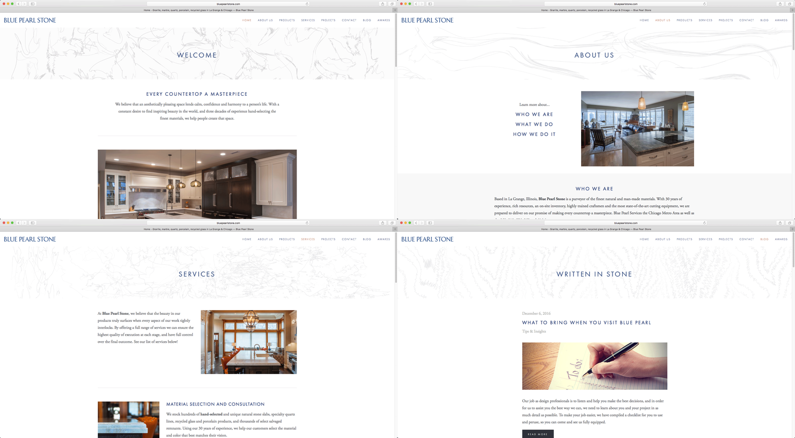
The corporate identity: the company’s business card and logo design, together with their website’s design.
