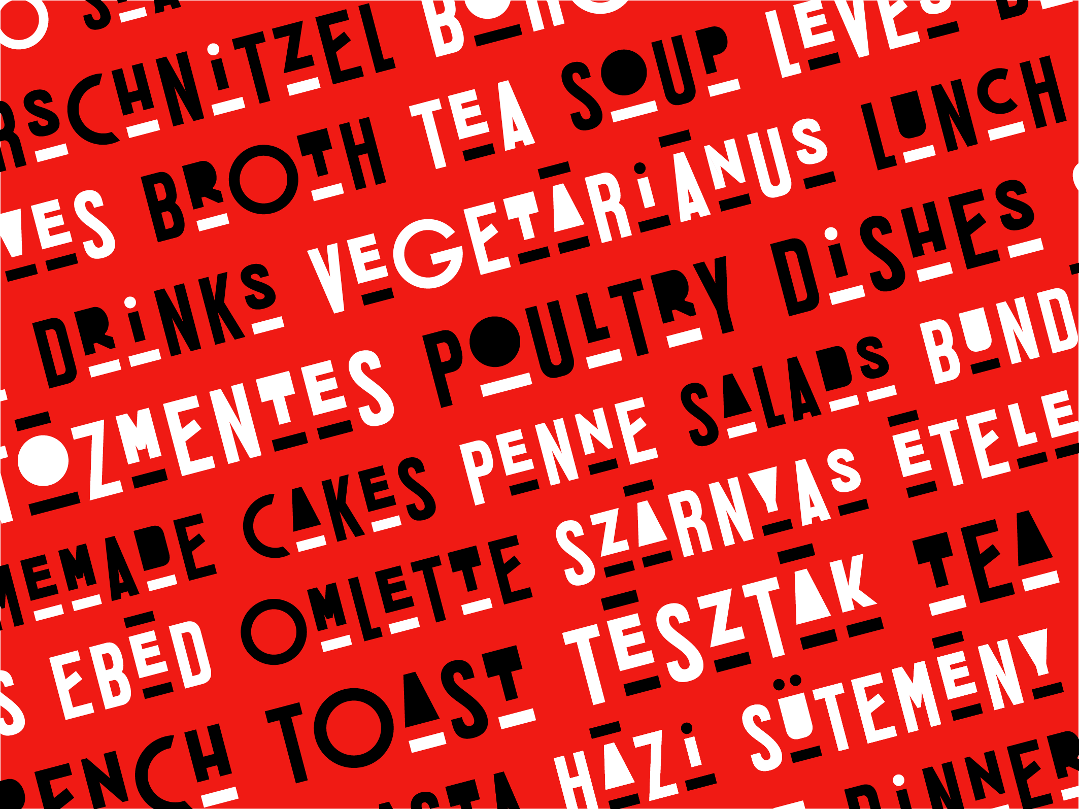
Mozsár is a café and restaurant with a slightly bohemian and a slightly constructivist atmosphere in the city center of Budapest.
I was asked to design panels on the façade of Mozsár. I decided to create a font which tries to reflect the atmosphere of Mozsár. My other aim was to have fun and raise a feeling for freedom designing these shapes. Also, I was curious whether it was possible to create a unified and coherent brand image using letters only.
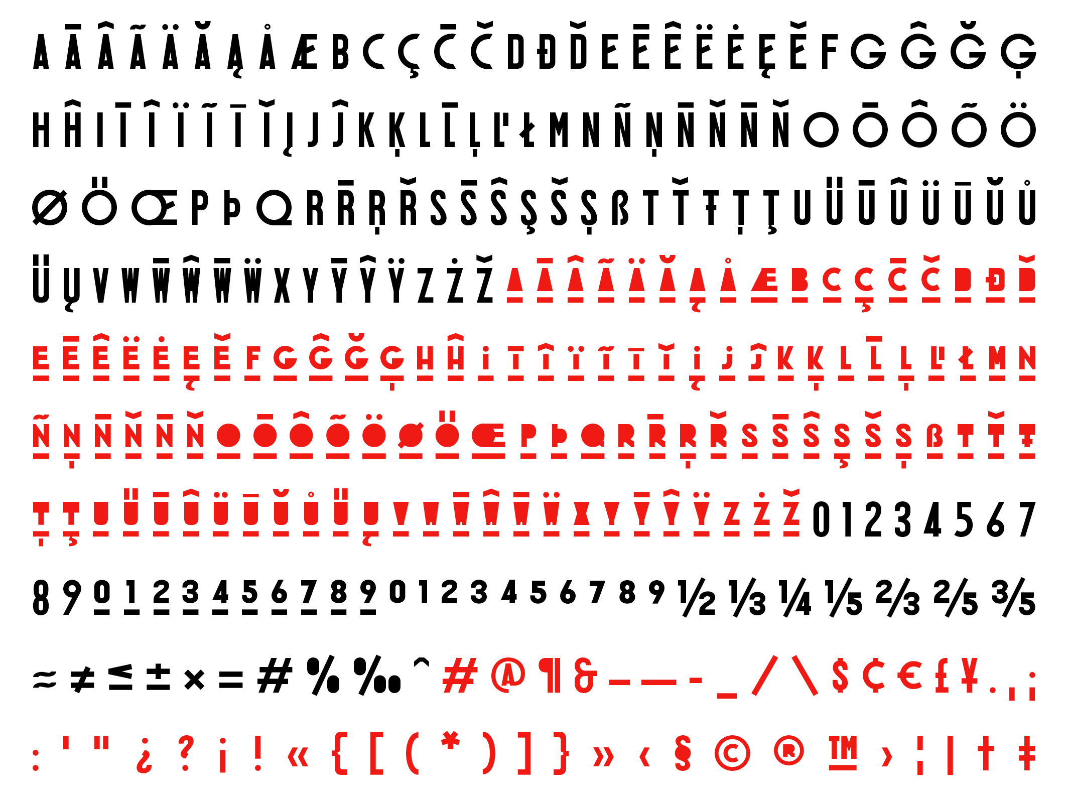
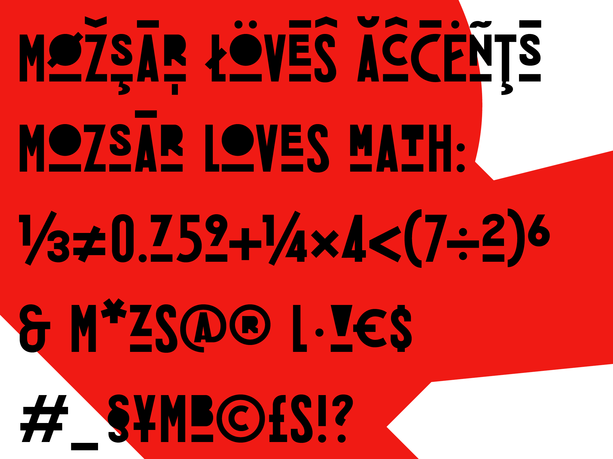
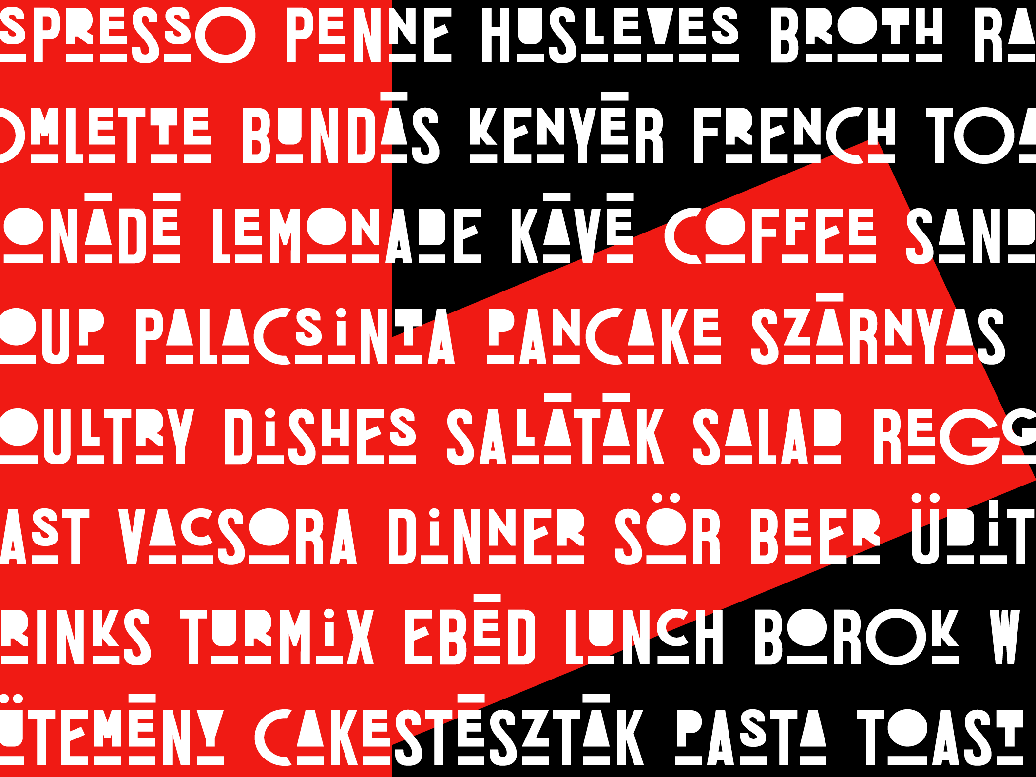
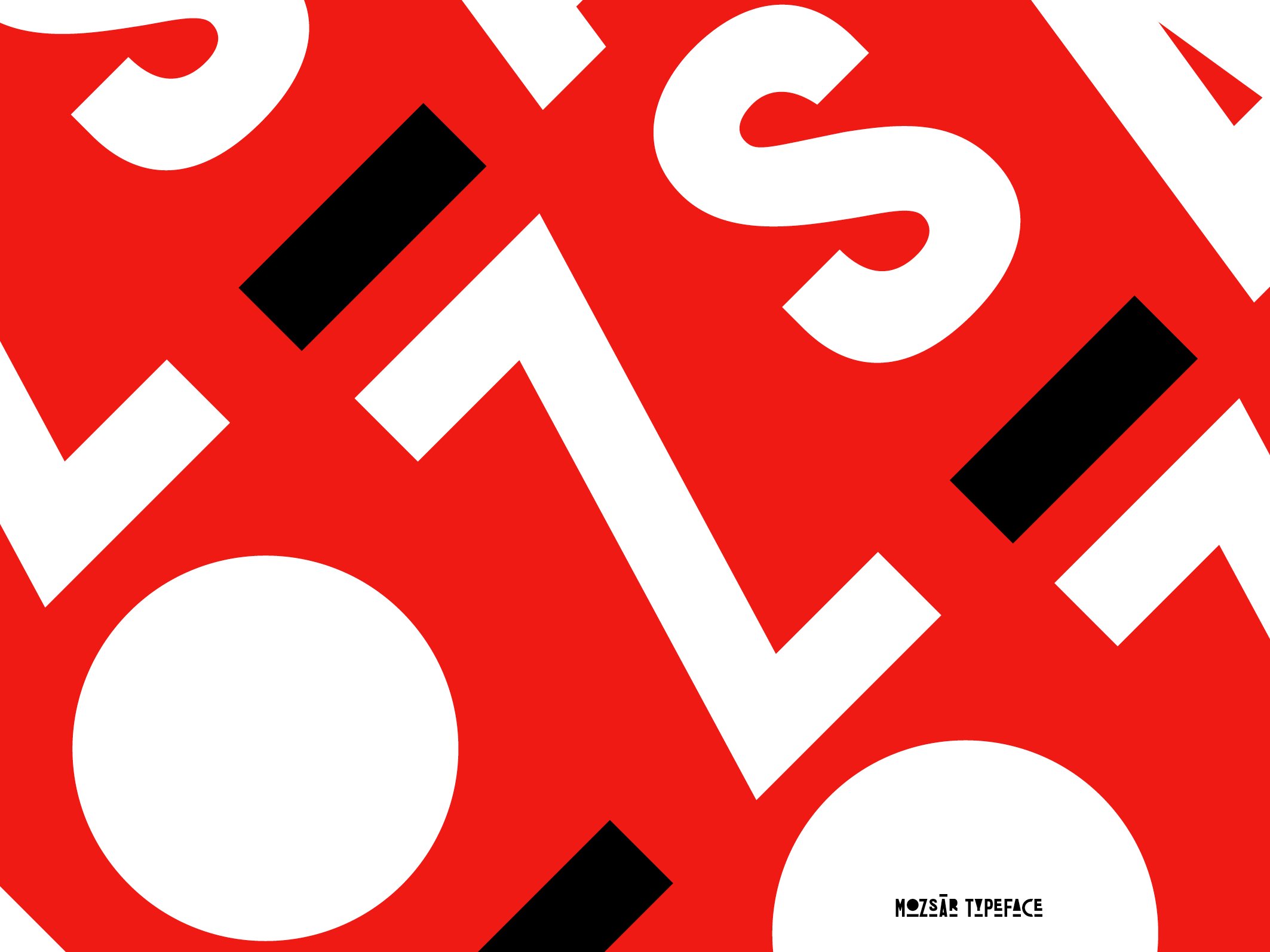
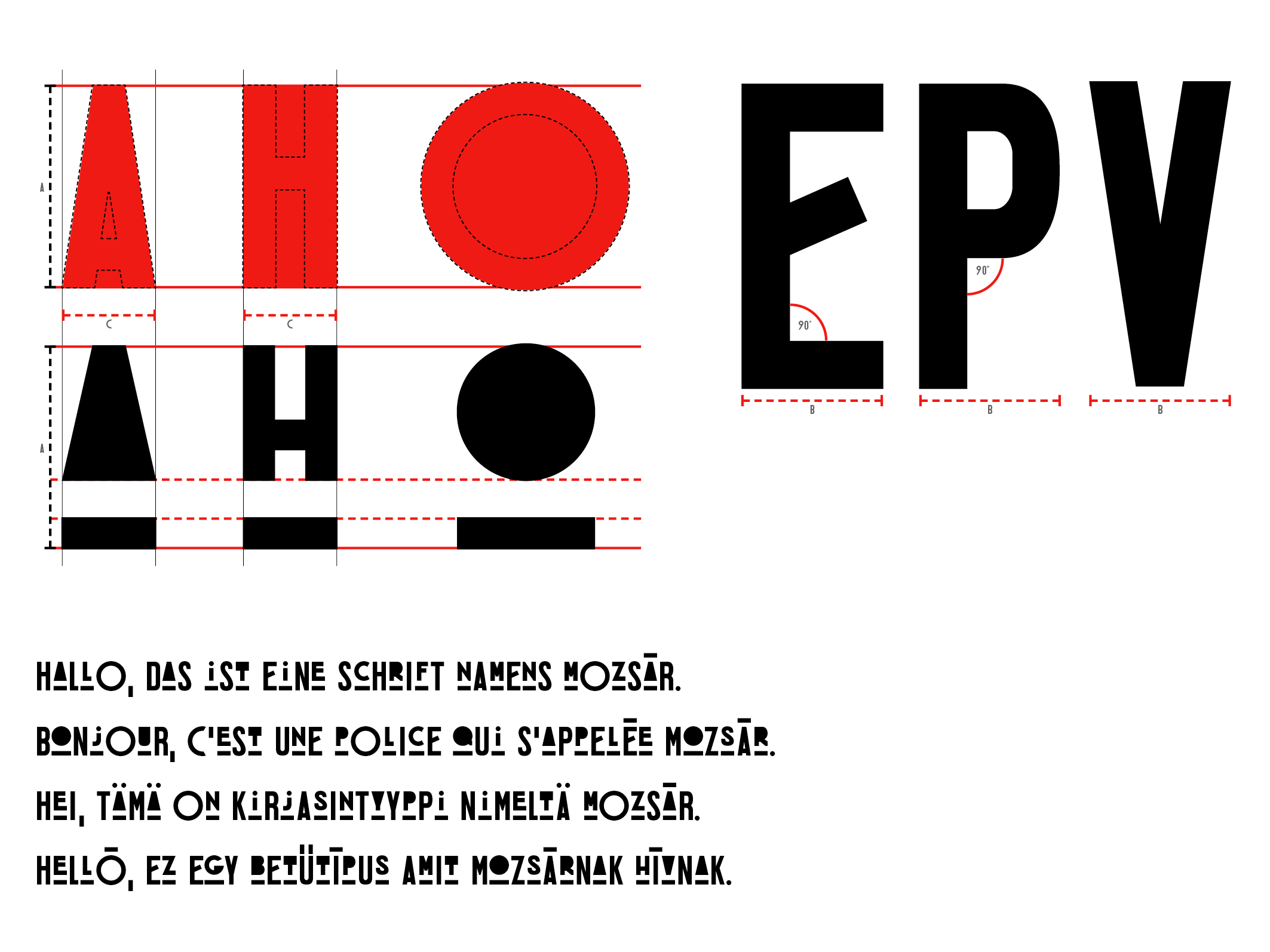
Mozsár is a custom display font. Every letter has an uppercase and a lowercase version. The characters are based on geometrical shapes.
To buy Mozsar click here.
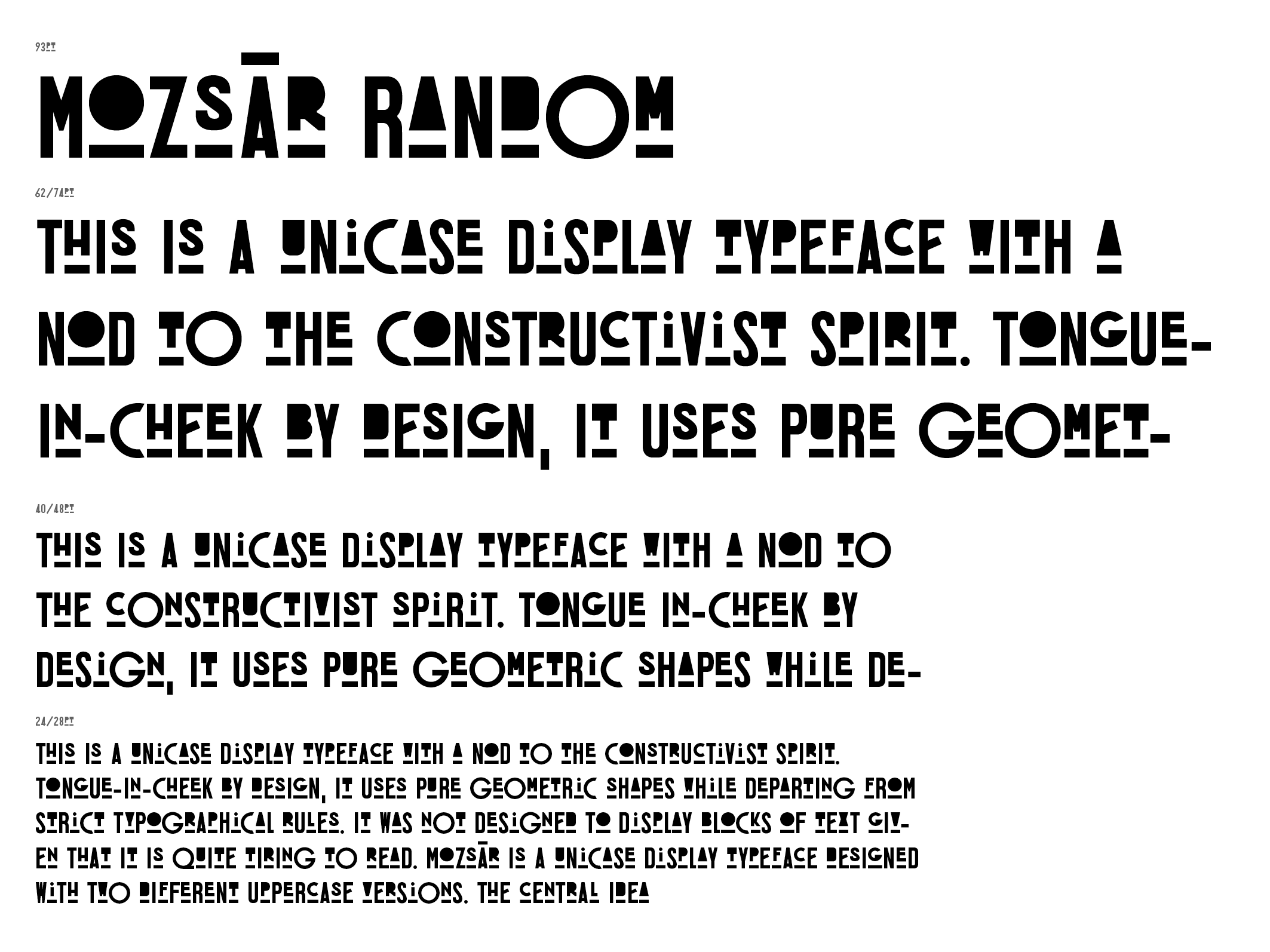
This is a unicase display typeface with a nod to the constructivist spirit. Tongue-in-cheek by design, it uses pure geometric shapes while departing from strict typographical rules. It was not designed to display blocks of text given that it is quite tiring to read.
The central idea behind this typeface was experimental in nature, namely that the two variants would randomly mix while text is being typed and the Contextual Alternates are switched on in Adobe Indesign, MS Word, Text Edit, etc. It was intended for display purposes.