Magazine and display font
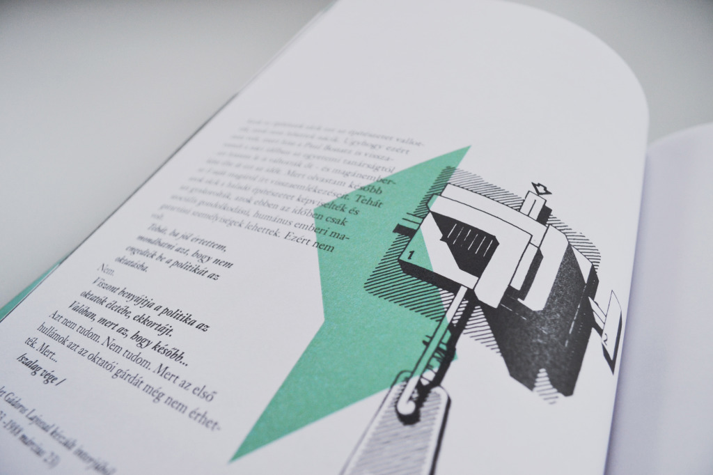
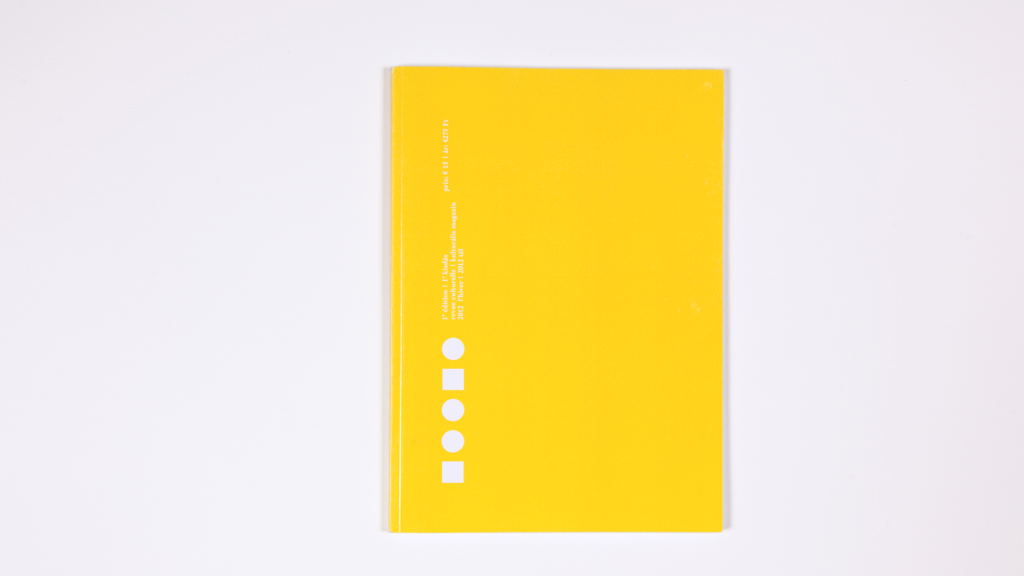
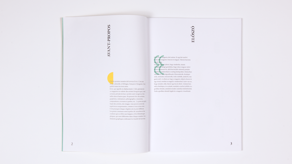
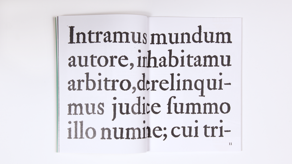
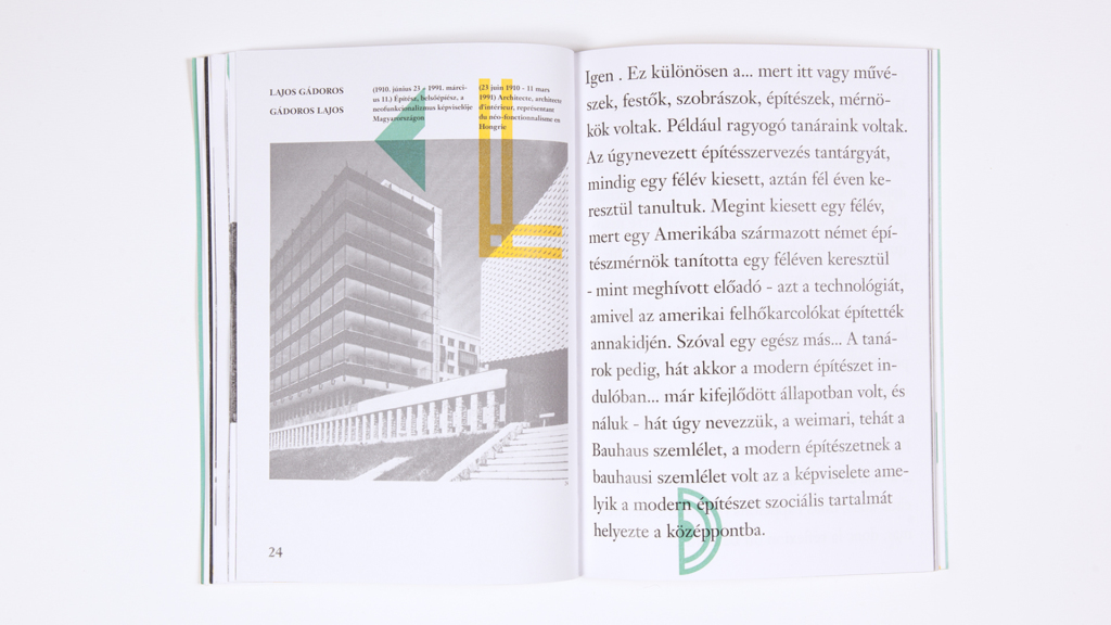
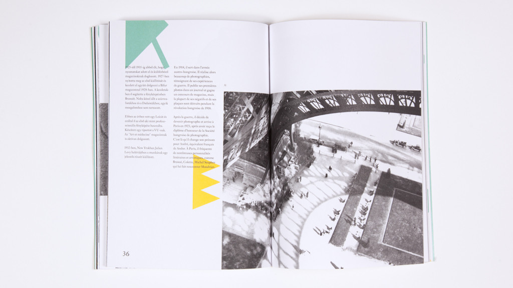
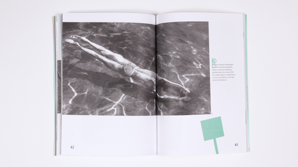
Errer is a bilangual magazine, written in French and Hungarian. The magazine features artists who at some point in their career travelled to or settled in an other country. Artists from all kinds of fields, from all over the world and from any time may be introduced. Errer means wandering and this is the basic concept of this magazine.
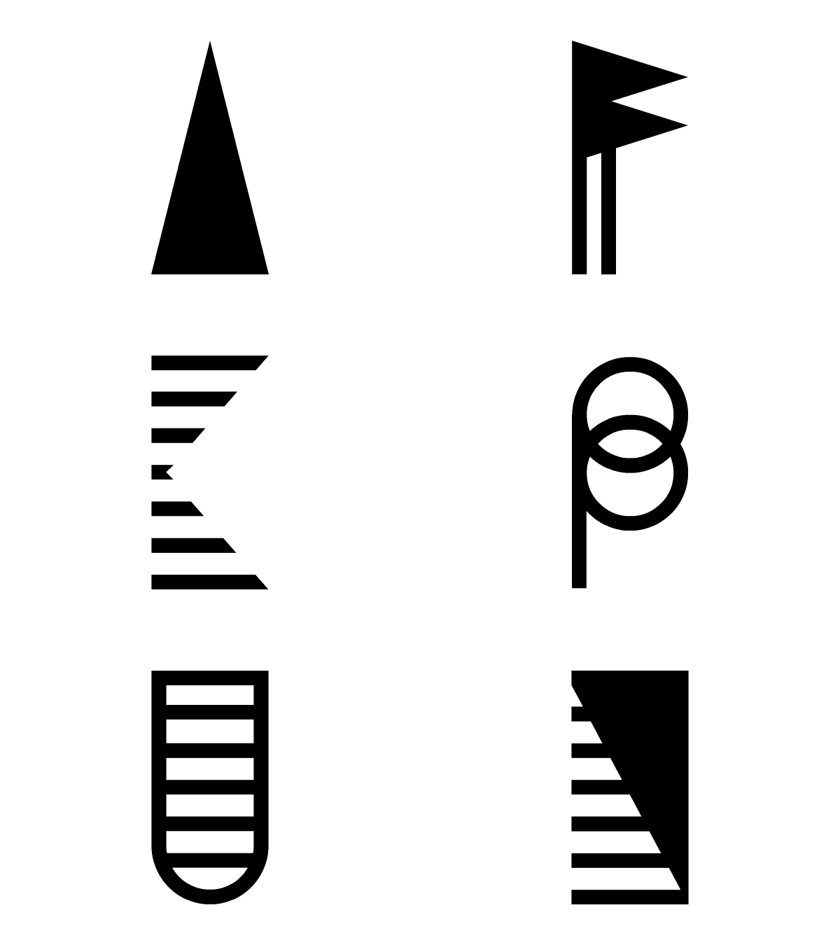
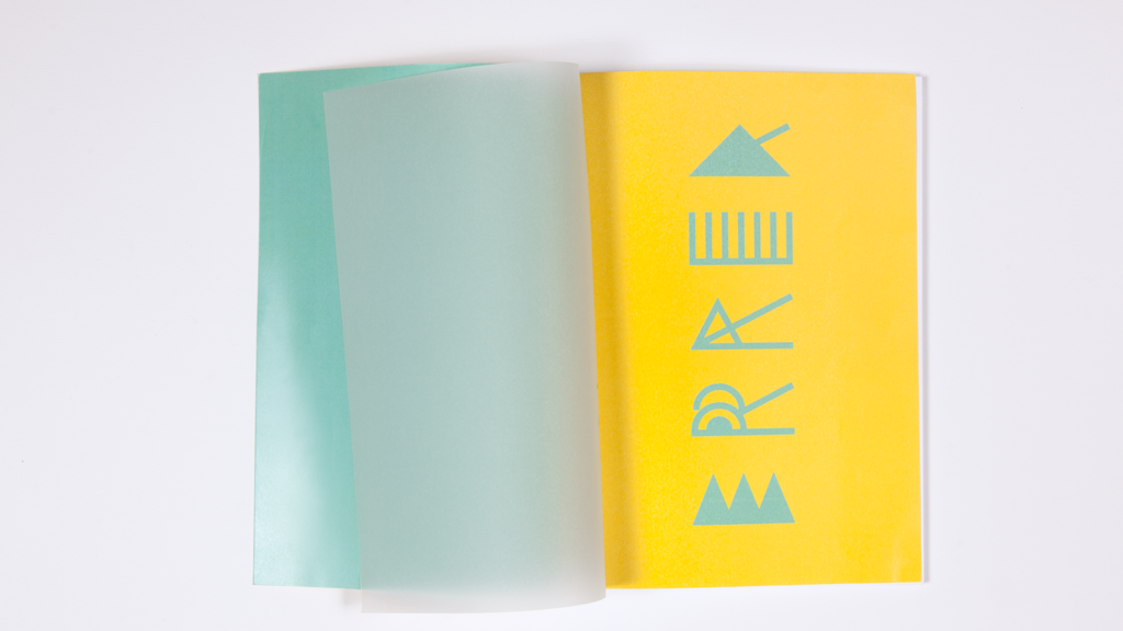
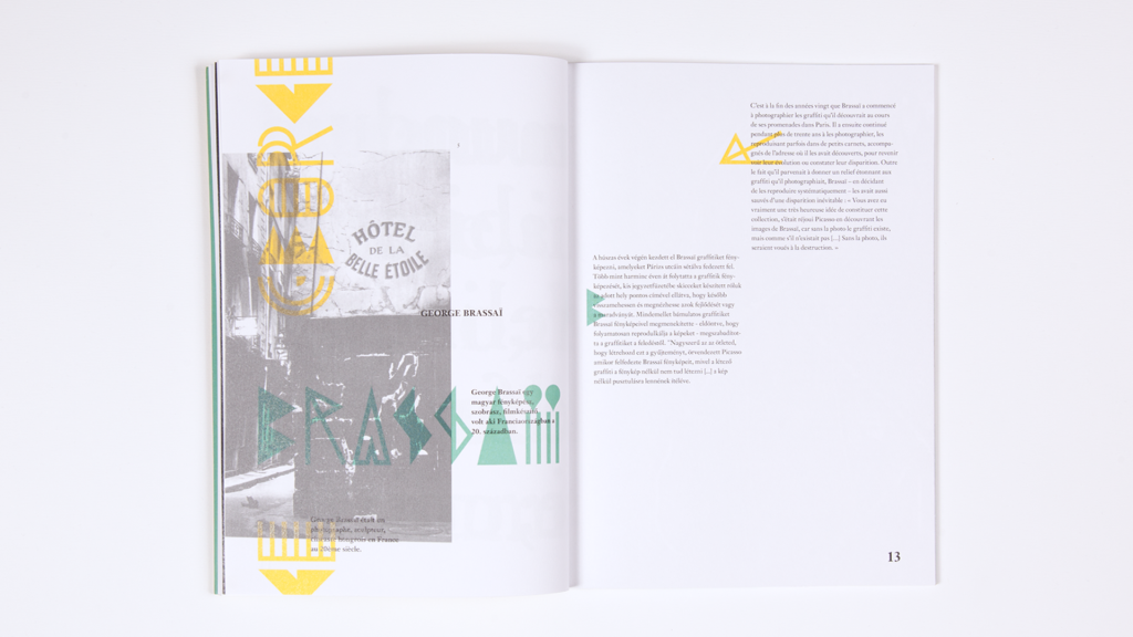
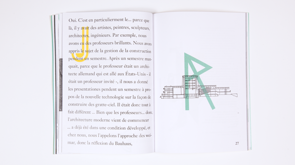
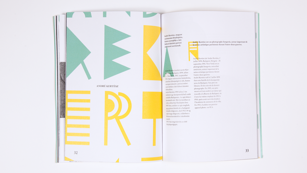
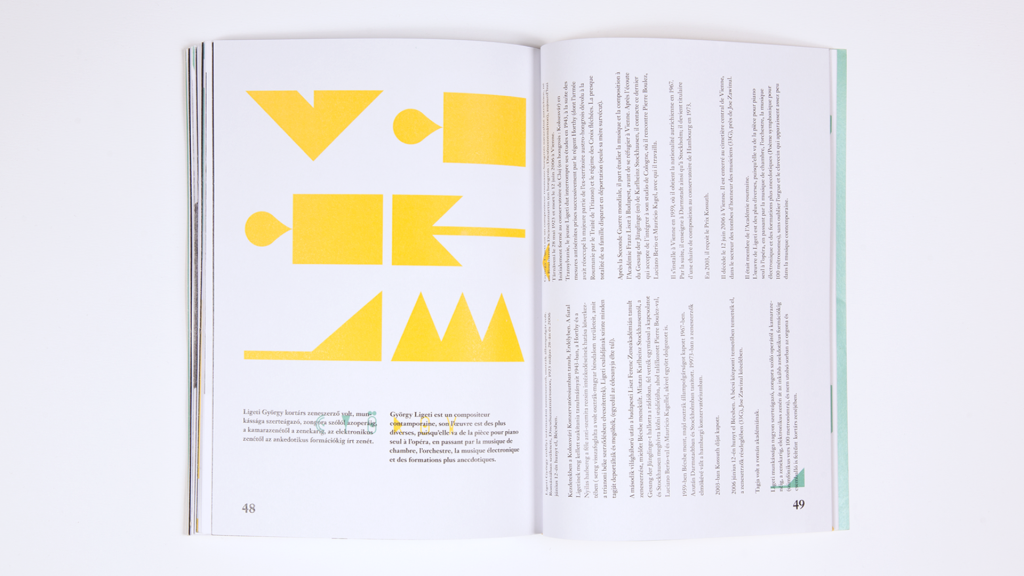
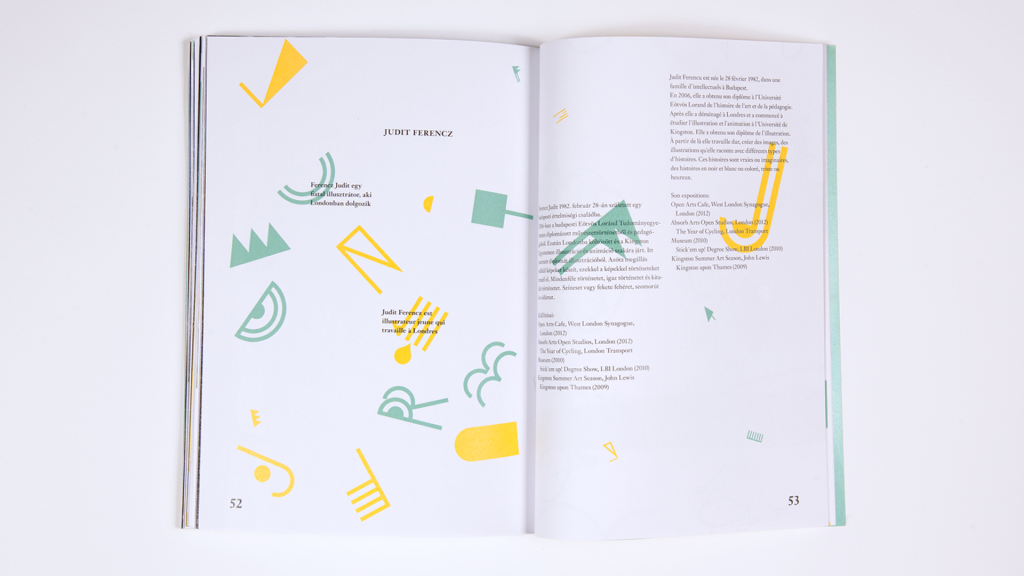
I created a display font too for Errer. This font also helps to navigate the reader between the two languages.
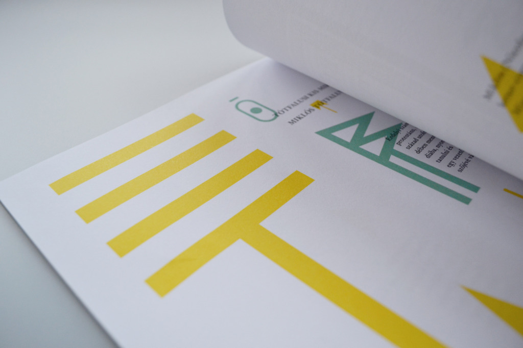
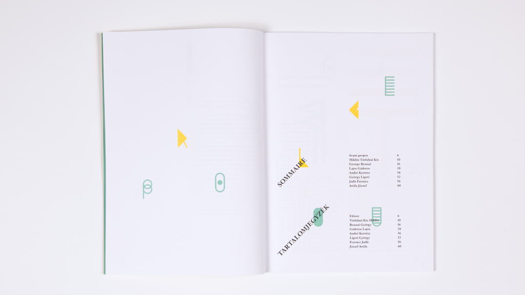
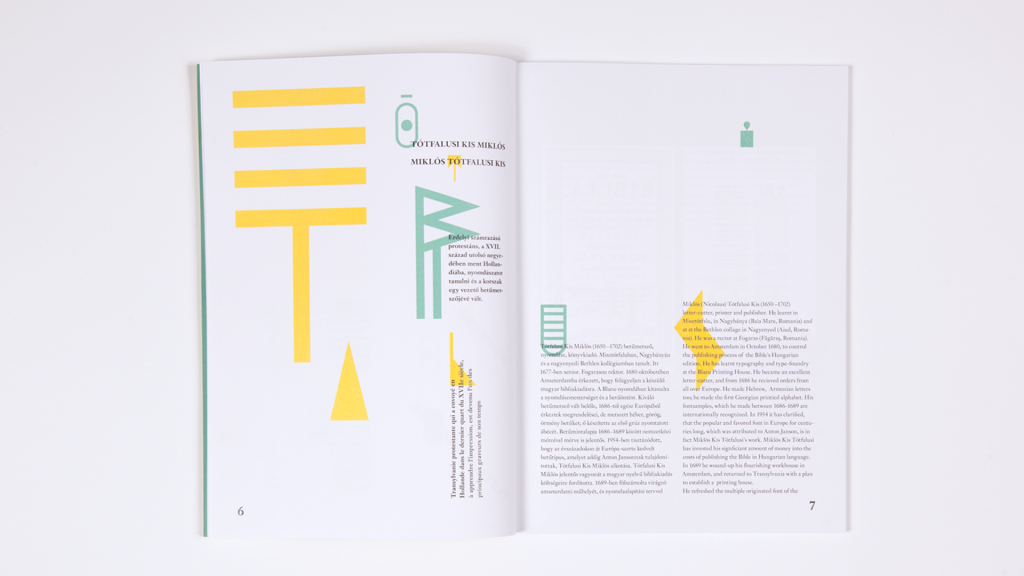
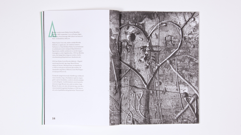
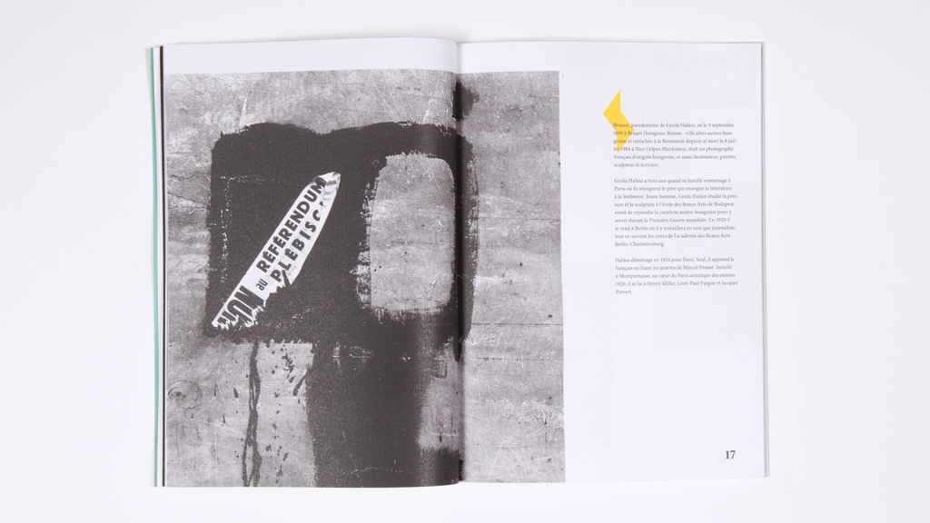
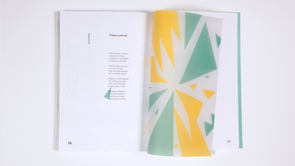
The layout also plays with the idea of wandering. Every chapter has been designed in a different way, thus the always changing layout permanently catches the attention of the reader.
Errer, which is a display font gives a visual unity to the layouts. Each letter has three different variations. The abstract, geometrical shapes and the always varying letters give the feeling of wandering.
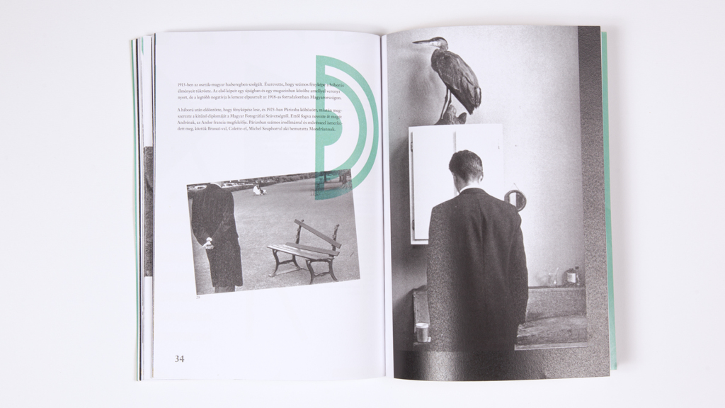
I used photos by André Kertész and Brassaï in the magazine.
